To boldly go… where no-one has gone before… design-wise BLT Communications, LLC – one of todays leading advertising agencies – ventured into unexplored territory (sorry!) by creating the arguably most controversial movie poster of 2009. It’s a clear winner in my eyes and I was glad to see that Varèse Sarabande also used this iconic image for the official soundtrack album (#1). When they released the Deluxe Limited Edition one year later, they went with a more traditional design (#2), but the bound case with a 28-page illustrated booklet more or less makes up for that.


My custom covers also start out with a more traditional take (#3), using the official poster design. But I went with the Star Trek logo from the second film as it better suited the canvas and colour palette.
Next are a series of font-based artworks (#4 to #6). For the first one I used a rejected poster concept I found within the film’s iTunes extras (#4). This design also marks the first time where I collaborated with my ten year old son :-) It was his idea to make the Enterprise sort of pop-out of the background image – a cool optical effect and nice contrast to the overall simplicity of that cover.
All credits for cover #5 go to deviantArt user “NewRandombell” whose custom poster I was luckily allowed to work into a soundtrack cover. His design stood out from the crowd for me and I tried to recreate it with my own templates as true as possible. The credits font is an original Star Trek font called “Montalban“. The Enterprise model is from the 2002 PC game Bridge Commander and was modificated by deviantArt user “trekmodeler“. I tried out a few different ships, but his version was the best one in the perfect angle to the giant logo in the back.
Although I spent way more time on custom cover #6 than I had planned, it still was a lot of fun. Once again a concept poster unburied from the iTunes Extras served as a template. I applied different shaders to the Star Trek logo to get an industrial texture that goes with the construction site setting. The right shadowing and lightning made it appear as if it was floating (or hanging) in front of the ship. From that on I decided to go full monty and added construction workers and tiny welders complete with sprites of welding sparks, while wires and cables (inspired by the Lego Movie poster) were dangling beneath them in the hot summer air. I love the subliminal Star Fleet insigina in the background, it’s really sad that the initial poster were not of higher resolution, otherwise I would have added even more details.
The last cover I created for this series (#7) was based on a really beautiful rendering of the Enterprise I came across during research. It was made by the German GFX company “The Light Works – Digital Imagery“. All I did was slapping on a few text elements on top and slightly adjust the colour settings. The rest does this powerful image which speaks for itself I guess.
Finally there’s also a faithful replication (#8) of a television series compilation by Varèse Sarabande from 1985. I love rearranging old Vinyl record covers and whenever I get the chance to do new stuff in the tradition of their old predecessors I take it.
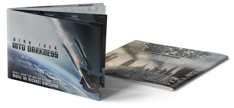
Warp jump forward into 2013, the key art for Star Trek Into Darkness in my opinion feels somewhat of a let-down. Just like the film, the artwork isn’t as bold or creative as the first one. They tried to go down the same route with the official soundtrack cover (#9), but I can’t help… it feels a bit too forced. I mean it’s not bad at all, but you can only break new grounds so often. I like the dark title font though, it creates a cool contrast to the gradient background. And I know how difficult it is to create this smooth transition between the text and the sky behind it.


For my initial custom covers (#11 to #13) I was aiming for understatement and as much minimalism as possible. No sparks, blur or lens flares. Within the film’s horrible ad campaign, I was lucky to find a few images, that for the most part met these criteria.
First I used the teaser poster (#11). I generally prefer teasers over final one sheets, because they usually allow the designer more creative freedom. Even if it resembles The Dark Knight a bit too much, it’s a powerful image and a good base to work with. But the next two covers are far more exciting.
I’ve found an image (#12) that probably can be viewed as the most spiritual brother of the first film’s one-sheet poster, almost like a dark, twisted version of it. And by far my favourite out of all of my Star Trek Into Darkness covers!
The third custom (#13) is based on a poster I surprisingly haven’t seen anywhere during the marketing campaign. I consider it one of the better posters of the film, the colours are great. Speaking of it, I’ve slightly adjusted the colour temperature of the title font in every cover to better match the background. For the album credits I’ve used the freely available font type Final Frontier Old Style by Allen R. Walden.
Custom cover #14 is actually based on a Japanese teaser poster from the first film. But as I removed the foreign letters I had to cover up the apparent signs of Photoshop with something. Turning it into an Into Darkness cover was most obvious.
The last ones (#15, #16) are once again remakes of older, established designs, transformed into successors to covers #8 and #9.
Digital booklets are a long overdue invention of the music industry and – at least in my case – often the crucial reason to buy an album digitally. If you’re more old school than me (and have purchased the album physically), grab it here for free.

[…] of old time classics like Deus Ex or System Shock, combined with a heavy dose of Firefly and Star Trek and you’re set. Who can resist with such […]
LikeLike
You should really put in the cover vom Soundtrack-Board here. It is fantastic.
LikeLike
I’ve included it in the Rejected Custom Covers post.
LikeLike
Nice!
Do you also have a digital booklet for Star Trek 2009?
LikeLike
Nope, sorry.
LikeLike
[…] come up with such a gorgeous poster campaign, after all those wasted opportunities for Star Trek Into Darkness. I only hope the film delivers what these fun and vibrant images seem […]
LikeLike
[…] the delightful section on Inside Out, I went back for more art for Giacchino. I had a look at Star Trek and one cover really caught my eye, the way it captured everything about Star Trek in one single […]
LikeLike
Ever thought of designing covers for the La La Land boxset of the original series? It’d be a heck of a project (15 discs!) but its got pride of place in my collection, and I’d be interested to see how you’d tackle it. Your retro work would be an ideal fit.
LikeLike
I have one particular Star Trek project in the cue, but for the films, not the show. I’ll keep it in mind though.
LikeLike