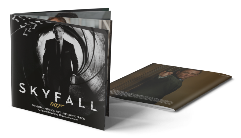
Framed by the two original artworks (#1, #6), here are my custom creations for the Thomas Newman soundtrack Skyfall. I really dig the design route they went with this James Bond movie. It’s almost British understatement. The high-contrast black cover is stylish and cool, just like 007 himself. And the sans serif font they were using for the Skyfall logo is dead on! Together with the film title it forms a crystal clear and very powerful logo treatment.
This series was a quick job, all done within a couple hours. I wanted to keep it simple and subtle, just like the original. The colours are toned down in general. The font type for the album credits and their placement within the canvas is coherent on every cover. With one exception…
The Limited Edition cover (#3) was my excuse to escape the design scheme a little. Like this whole series, it’s reduced in every possible element. But I took the liberty to add texture effects and drop shadows in order to give it more depth. It’s meant to be a cardboard or digipack cover embossed with gold lettering. A few revisions were necessary, but in the end it came together as I intended.
I do realize there’s no Limited Edition out there, but there’s certainly an iTunes exclusive track called “Old Dogs, New Tricks“. Add that track together with Adele’s single and David Arnold’s “The Name’s Bond… James Bond” to your rearranged digital copy and there you have it… a Limited Edition per se.


[…] back-lit scene by director of photography Roger Deakins, who by the way also worked on Skyfall. I really love the atmosphere in this shot and also the well suited sharp-edged title logo. My […]
LikeLike
[…] (and a startling low-res IMAX poster) – that’s nothing to get excited about. Unlike my Skyfall cover series I wanted to offer some variety, so I turned to the fan community, which was way […]
LikeLike