When Trent Reznor and Atticus Ross’ score to The Girl With the Dragon Tattoo was released in December 2011, the online film music fanbase had just calmed down from ranting and raving about the duo’s first foray into the holy realm of film scoring, The Social Network. Feelings ran high, especially after they snatched the 2011 Best Original Score Oscar from all the other honourable composers. So when Reznor announced a massive two and a half hour long 6-LP-Set for Dragon Tattoo, soundtrack critics around the world must have been completely baffled. And indeed they were…
")
")

")

Regardless of the debatable quality of the music, the package it came in was magnificent. The hard plastic “ice” slipcase houses a metal covered book of six 180 gram vinyl records, an exclusive fold-out poster by Neil Kellerhouse and an 8 GB razor blade USB drive which contains the full album in high-fidelity 96k audio. Each set was personally signed by Trent Reznor and Atticus Ross and limited to 3000 items worldwide. It was nominated for a 2013 Grammy for Best Boxed or Limited Edition Special Package for a reason if you ask me.
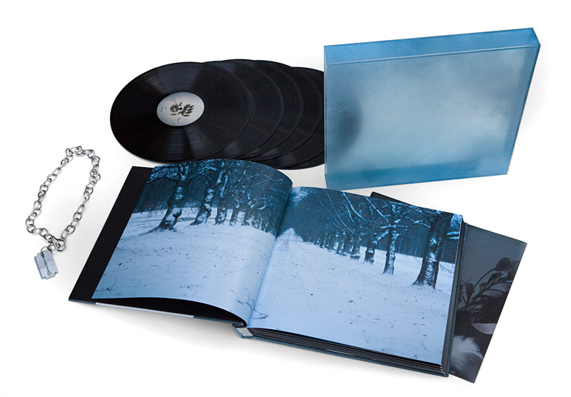
Concerning the original soundtrack artwork (#1, #4) I’d like to requote art director Rob Sheridan who described the set as an “unique, limited edition package that highlighted the album as a standalone work of art, independent from the film but connected to it. Ice and winter were a major theme in the tone of the music, and as such became the inspiration for the look and feel of the package”. He further underlined the opportunity to create something “anti-commercial” with no interference from the film studio at all. To complement the musical score rather than the branding of a film is a really unique approach; one that definitely influenced me in my creation of alternate custom covers as well.
I downloaded and used two original fonts (CM Dragon Tattoo and an altered cut of Jupiter Pro) especially designed by L.A. based artist Neil Kellerhouse just for this movie. Talking about Neil Kellerhouse, please let me first throw in a quote by Margaret Sati, host of the Cinematic Corner. Here’s what she has to say about director David Fincher:
[…]there is really no one like him out there and his films, made with surgeon’s precision and created with elegant, cold style are truly one of a kind.
You could basically say the same about Kellerhouse, who by now is Fincher’s go-to-guy when it comes to poster design. His use of colour and composition is remarkable. But it’s the font design that became his key signature. You can spot a real “Kellerhouse” immediately solely based on the font type. His designs are sharp-edged yet thought-provoking and always out-of-the-box. And his level of detail is amazing! A perfect fit for David Fincher’s latest bunch of movies.
With Sheridan and Kellerhouse at the helm, I had a really hard time coming up with something that doesn’t fall completely flat compared to those brilliant original designs.


")
")
")
I decided to go down the font design route and try to do something entirely different. While customizations were rather subtle on my first attempt (#6), my subsequent designs went astray all the more. The first deviation was based on the fold-out poster from the Limited Edition (#7). I designed my own logo treatment using the free font “True Lies” and complemented it with Kellerhouse’s original font to have at least one evident connection the the movie.
Following that comes a custom cover based on the teaser poster of the film (#8), which was the subject of controversial public discussions. I’m sure you know why. I wanted to evoke a magazine article vibe with that one and tried out different font styles before I settled on a self-made alteration of “Lydian Csv BT“. Because of the elaborate title-design I chose “Futura” as a calming opposite pole.
This brings us to my most ambitious piece within this series. Custom cover #9 came together by incident, and yet took me a fair amount of time. It’s basically composed of multiple blendings of a poster and title variation by Kellerhouse. But because of the low resolution image, I decided to recreate the whole title card from scratch, using all kinds of font styles. In the end I had thirty-three Photoshop layers of font fragments. Partly influenced by the Saddle Creek 50 songs compilation, I played around with various blending modes until I was happy with it. And I still am.
My last two customs represent the two original songs from the soundtrack, The Immigrant Song by Trent Reznor, Atticus Ross and Karen O (#11) and Is Your Love Strong Enough? by How to Destroy Angels (#12). Originally there was only an official cover for the single release of the former one, so I designed an accompanying artwork for the latter one as well.
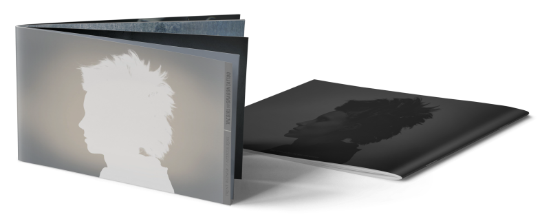
Sitting on a pile of so much awesome original material, created by such a creative bunch of people, I couldn’t just leave it at that. I wanted to do something else, anything and while I was reading and watching the great title sequence making of on Art of the Title, I imagined a fleshed out version of the original digital booklet. And that’s what I did below. Growing from five to twentythree pages, bursting with gorgeous hi-res images from the brilliant main title sequence and featuring the lyrics to the two original songs. I had a lot of fun creating this one and hope you’ll be enjoying it as well.

[…] the primary cover artwork came pretty close to the official one (#1). Yet, opposed to its two predecessors, this time the label added an extra Soundtrack From The Motion Picture tagline, making it clear […]
LikeLike
These are wonderful, I especially love the ones with the frost-looking texture on them, fantastic work!
LikeLike
[…] the same quality design for Atticus Ross’ solo work, as I did before for The Social Network, The Girl With the Dragon Tattoo and Gone Girl. I wanted to give the soundtrack the feel of a stand-alone record. To enhance it a […]
LikeLike
[…] came in form of the teaser poster, created by the one and only Neil Kellerhouse. And as with every post that includes his virtuosity, I usually quickly fall into fangirl mode and rave […]
LikeLike