Movie-wise the month of May is usually the annual kick-off into Blockbuster season. The time when Hollywood really gets the ball rolling. Last year Godzilla was fueling the hype machine and this year Joss Whedon seems to be demanding the spotlight with his highly anticipated Avengers sequel. And for whatever reason I thought Mad Max: Fury Road might play a big part as well.
While that may very well be true for George Miller’s film, I Initially wanted my custom covers entry to be a really big thing as well. But unlike the spectacular teaser trailer, the whole poster campaign left me badly underwhelmed. It was really disappointing to see so much wasted potential and I was about to skip this one as a whole. In the end it was the roughness and gritty quality that convinced me to get busy on this cover series. I wanted to utilize my Machine Wash Deluxe filters again and Mad Max: Fury Road seemed like the perfect opportunity for that.


")
This series starts with a toned down version (#1) of the original artwork. I utilized the type treatment and overall layout of the teaser poster. I think this colour palette looks way better than the saturation overkill of the final one sheet. It’s dirtier and more post-apocalyptic and I prefer these two qualities over the original album artwork (#2).
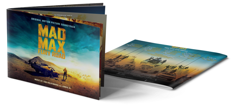
For the next bunch of covers (#3, #4, #5) I couldn’t help but go with the source material provided. I briefly considered toning it down myself, but after all these covers are meant to represent the original soundtrack of the movie. So I decided to stick with the original, even if I differ in opinion.
The logo-only cover (#6) was accomplished by using the content area fill tool of Photoshop to create a filthy background wallpaper out of the original film logo. I superimposed an inverted and scaled-down version of the logo and tweaked the colours to make it look more natural. Once again I tried to match the font design of the teaser poster using a font called “DJ Gross“. It’s not 100% authentic, but it works.
The last three covers are all based on Poster Posse’s fan poster galleries. Cover #8 does feature an iconic image by John Aslarona. I really love the colour palette, it’s very 70’s like. My only additions were the original 1979 Mad Max logo subtitled with a font ironically called “Gregor Miller’s Friends Font“.
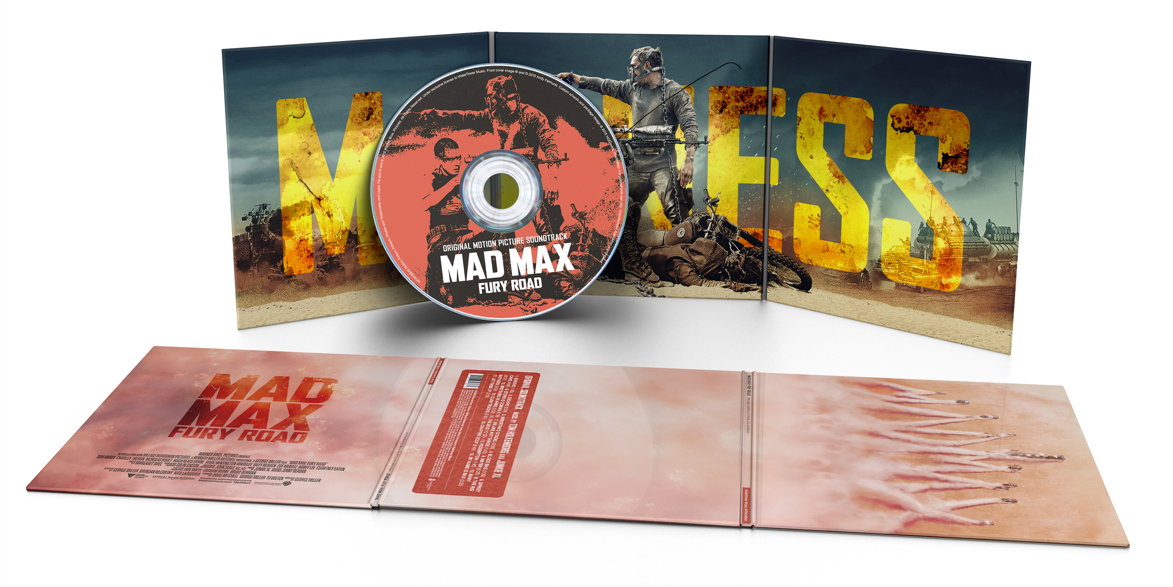
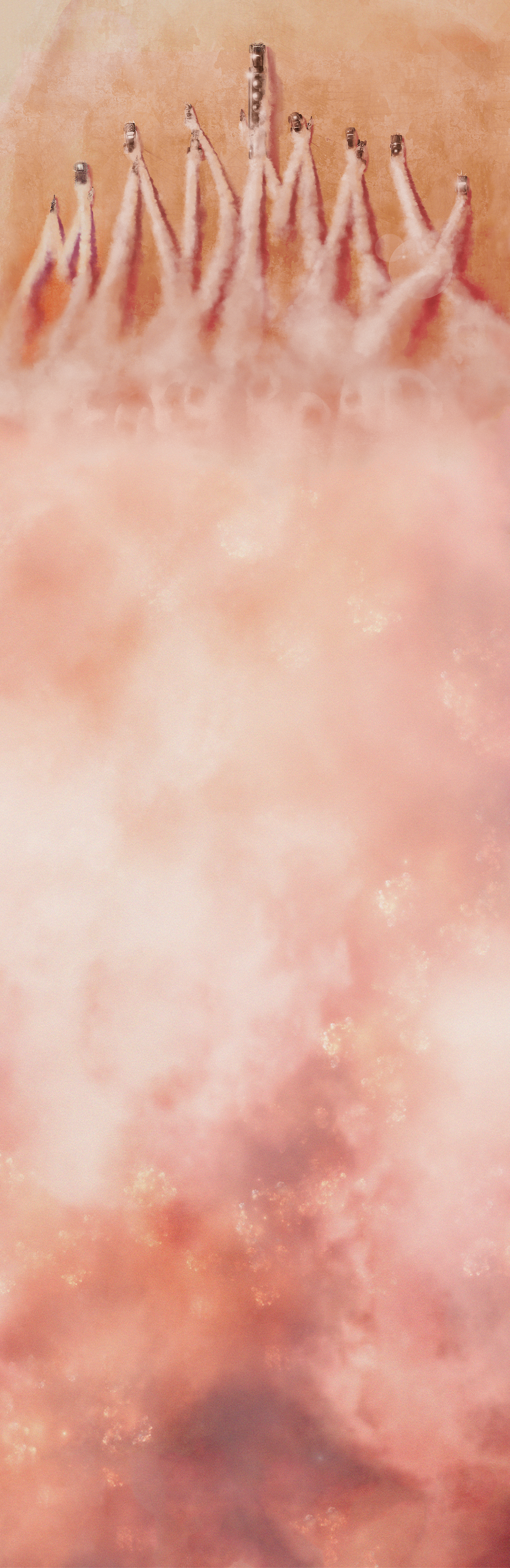
The source image for the last one (#9) was created by one of my favourite artists out there: Andy Fairhurst. Somehow I was reluctant to add any text to his amazing drawing. It was simply perfect as it was! That’s why I decided to make two different versions. For one a Vinyl version with a little promotional sticker in the corner. And for another a CD version without any additional text at all. I wasn’t brazen enough to only post the front cover, so I went and made a full set which you can see above. The extension of Andy’s dust cloud was done with this texture and a lot of colour-correction and custom exposure. To not spoil the front motive I again only applied a subdued (and easily removable) sticker in the back. I hope you like it!

Excellent, as always! I’m not loving the score at the moment, but these covers are great. 5, 7, and 9 are my favourites.
LikeLike
I haven’t heard the score yet and I guess I wait until I’ve seen the movie. But I don’t remember anything of the old Brian May scores, so I’m pretty much open for anything.
Btw, great to see you here around! I would kill for a mention in the SoundCast ;-)
LikeLike
Not sure when the next Soundcast will be, but I’ll try to remember!
LikeLiked by 1 person
That would be totally awesome :-D Thanks, Richard!
LikeLike
These are superb. I like, #1, #6, and the brilliantly retro #8.
LikeLike