Summer 2016 kicks off with a particularly colourful post for Star Trek Beyond, the third entry in the franchise reboot. And what a delight to see BLT Communications to come up with such a gorgeous poster campaign, after all those wasted opportunities for Star Trek Into Darkness. I only hope the film delivers what these fun and vibrant images seem to promise.
Back for another round is also Michael Giacchino and I’m really glad he stayed with the series, as I enjoyed his two previous scores a lot! The official soundtrack album (#1), once again published by Varèse, is based on the teaser one-sheet. And I’m sorry to say so, but I think the cover artwork is an utter fail.

")
")
Considering the source material it’s quite an achievement to ruin the artwork like that. I understand the necessity to feature the full title on there somewhere, but that’s no excuse for such a botched design job. The font size is way too large and distracts from an otherwise beautiful image. And the redundant use of the word “BEYOND” makes it even worse. No need to hammer it into our heads by adding all this black and bloated text, Varèse. How about a little subtlety?

In my first attempt I skipped the Star Trek title as a whole, relying entirely on the audience’s intelligence and wit. Because, let’s be honest, the USS Enterprise is such a popular cultural icon, it should be enough to identify this as a new Star Trek score. But then my ambition kicked in and I absolutely had to give a fully-fledged logo design a shot (#2, #3).
My first version was created with a Photoshop plugin called “3D Invigurator“, but I couldn’t figure out the right perspective. So I ended up painting the 3D-tilted Star Trek logo by hand, including lighting and shadows. The CD and Vinyl versions arose from two slightly different source images and I really like the idea of the CD cover being an alternate camera angle of the bigger record sleeve artwork.


")


Above you can see some more posters turned into custom cover artworks. It’s almost as if BLT ignited an explosion of colours to separate this campaign from their earlier entries. They’ve also jumped the ubiquitous retro bandwagon by creating a modernized version of Bob Peak’s original poster for Star Trek – The Motion Picture. And I think it’s truly amazing! I’m a sucker for such throwbacks and thus used this poster for two different custom covers (#4, #9).
I’ve also continued my earlier versions of the TV series soundtrack albums (#8). It’s part of the fun to establish a distinct design and apply it onto future soundtrack entries. I’ve done this several times now on the most different film series and it’s always fascinating to open up old Photoshop (or for that matter, PaintShop Pro) files and recognize the half-assed work techniques I’ve practiced back then.
The gallery below is another relic of bygone times. I normally don’t make those character-posters-based custom covers any more. It tends to unnecessarily inflate my blog entries without that much of a purpose (I doubt that anyone wants Scotty’s Star Trek Beyond (#15) cover to represent their digital version of the score). But every once in a while, when it doesn’t take that that long and is easy to accomplish, I still sit down to them. Especially when the poster design is as blazing as this one.
")
")
")
")
")
")
")
")
")
Update:
I came up with a slightly different design for Varèse Sarabande’s recently released Deluxe Edition, mainly because of their awkward placement of the Deluxe Edition banner. Furthermore I wanted to include that colourful Spock poster I’ve also used in #6. Below you find versions for your digital (#10) and also retail release (#11, #12, #13) of the score. Happy printing!
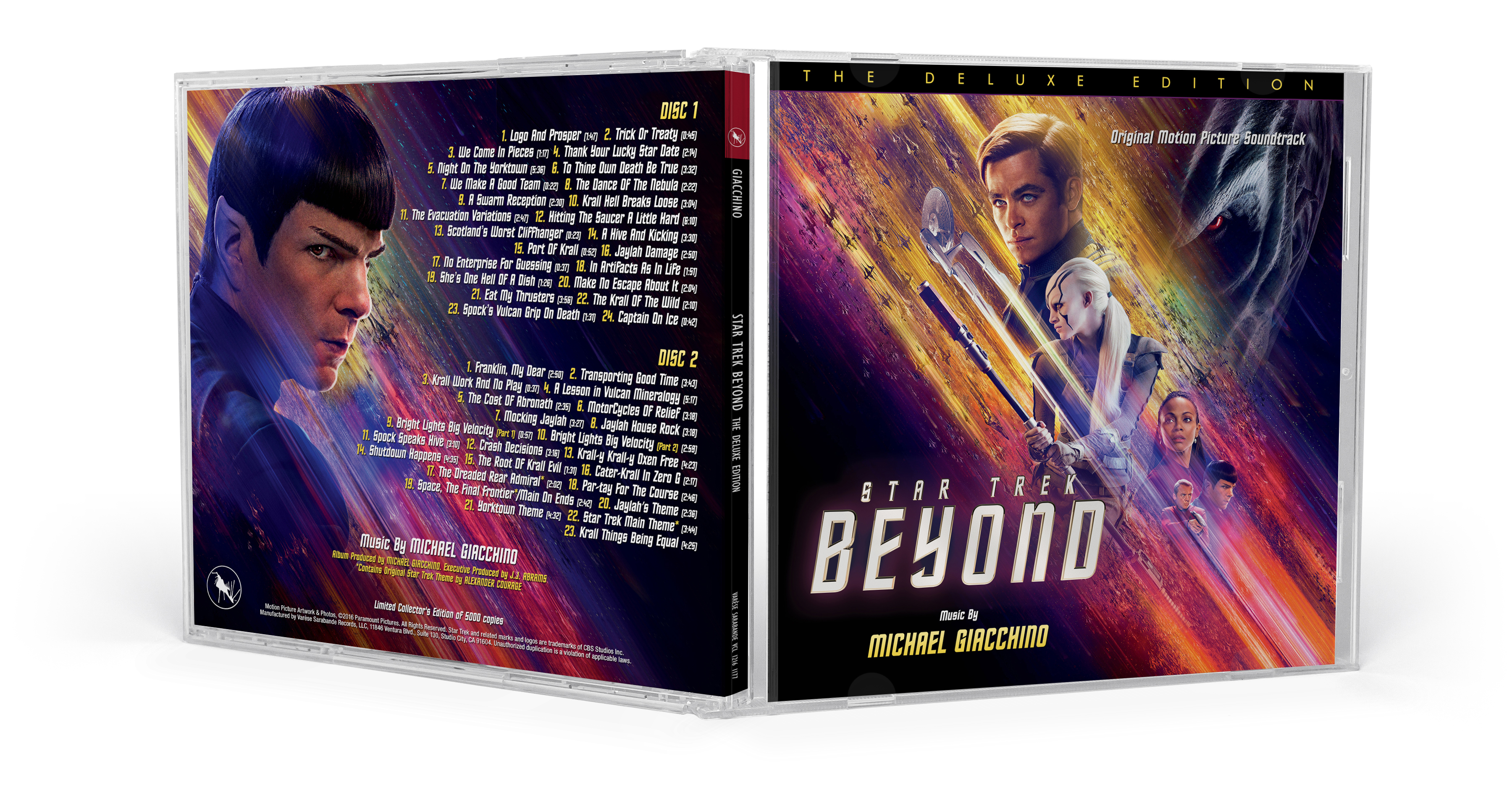
 (Front)")
 (Booklet)")
 (Back)")
 (Inlay)")

I love your job on these covers! I have to say my favourite is absolutely #2, which is delightfully colorful.
(and you made the teaser poster into a much better cover than the original!)
#4, #9 and #6 are really nice as well… :)
Thank you for all this good work! :D
LikeLike
Thanks, always nice to see returning faces
LikeLike
You’re welcome! It’s certainly always a pleasure to come back :)
LikeLike
[…] of a CD/Vinyl bundle with two matching artworks (#9, #12). I’ve made a similar set for Star Trek Beyond in June of last year, but these Prometheus covers were conceived and designed a long time before […]
LikeLike