My most wanted film of 2012 was Prometheus by Ridley Scott. Despite all its mind-boggling flaws, I still enjoyed the hell out of this movie. A thing that initially couldn’t be said about Marc Streitenfeld’s score though. While it’s still very effective and on certain tracks actually really good, it definitely fell behind the previous four scores of the Alien saga (yes, even Resurrection).
Having said that, it kinda grew on me over time and I really appreciate the score now for being able to set the mood. Its atmospheric and unsettling sounds deserve recognition and what better way than to create a bunch of nice custom covers for it. 61 in fact (in words: sixty-one!). I never planned it to grow this big, but over the last three years things got slightly out of control…
")
")
")
My first objective was to remake the official cover (#1), because I never liked it that much. In my opinion it was too bright and colourful for such a dark kind of music. In my attempt I tried to keep everything in the shade (#2, #3), similar to the original soundtrack artwork for Alien. I made it as black as possible, while still maintaining the iconic image of the Engineer’s head. This was also the first cover, where I let myself loose completely and tried out countless alternations, because why not.


I waited for over a year after the theatrical release to start with this custom covers series, as new fan-artwork was continuously sprouting around the web. Also, I didn’t have this compulsive desire to be relevant and release custom covers as close as possible to a new soundtrack release date (a real absurdity!).
No, instead I worked on Prometheus on and off quite arbitrarily – at my own pace and mood. A luxury endeavor, for sure. It had sort of evolved into my go-to-place whenever I felt the need for creative refreshment. And I think it shows, for this might be my vastest collection of custom covers for a single soundtrack album yet.
")
")
")
")
")

")
One of the new ideas for this series was the concept of a CD/Vinyl bundle with two matching artworks (#9, #12). I’ve made a similar set for Star Trek Beyond in June of last year, but these Prometheus covers were conceived and designed a long time before that.
I went with two slightly different angles of the same scene, the infamous “Prometheus School of Running Away From Things” from the climax ending of the film. Even though this scene is one of the most dumbest in the whole film (which is quite an achievement), it looks really fantastic on paper. The details are gorgeous and colours eerily beautiful, especially on the widened Vinyl version.
I like to imagine that both editions come with one half of a special download-key which, once combined, gives access to additional bonus content from the web. Maybe I should work in marketing. Or maybe not.
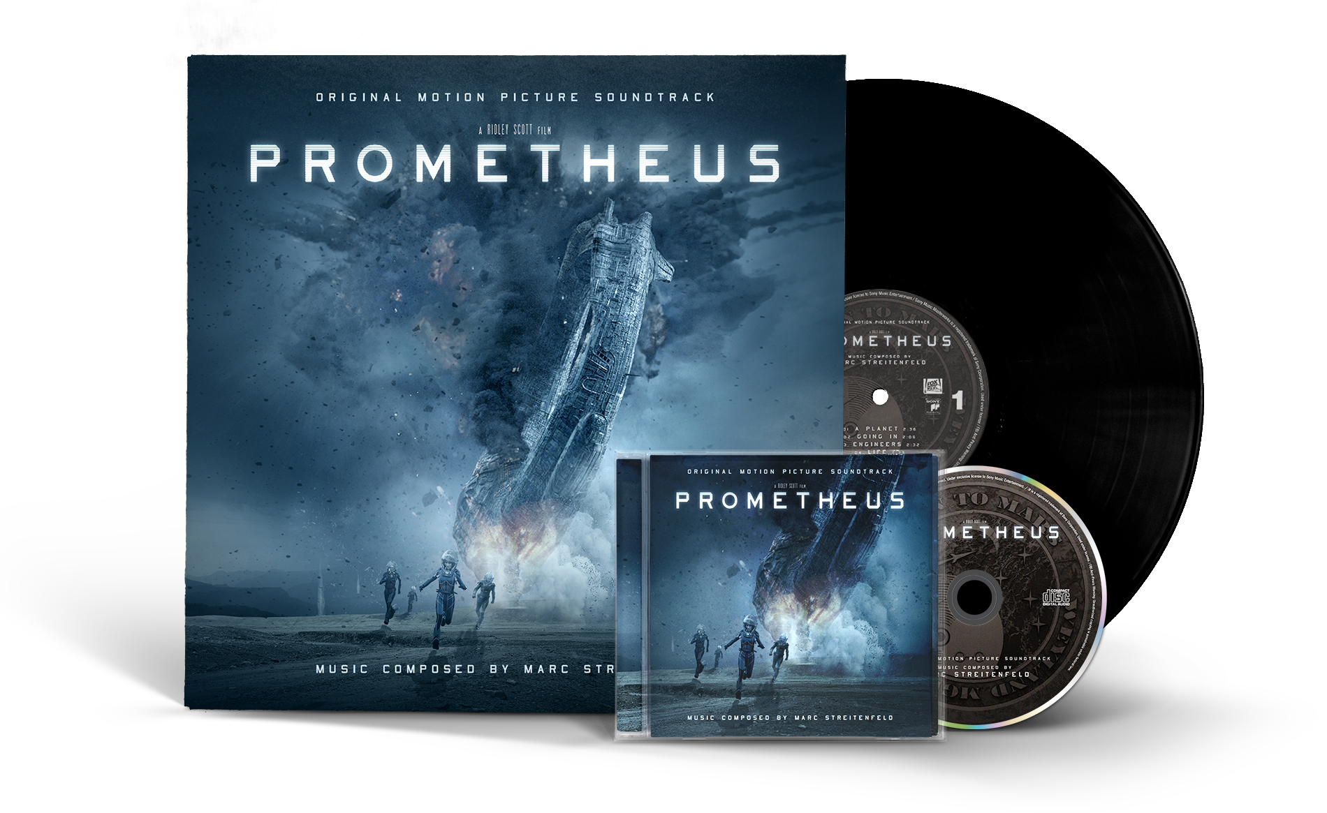
The CD version also got an alternate, less spoilery design as well (#14, #15), using an ultra wide shot of the three main characters with the eponymous spaceship in the background. I’ve mirrored the image to make it wrap around the spine and employed two different font types. For once the feathery “Aviano Sans” and also the bulky “USN Stencil“, both of which were featured in the official promotion material as well.

Prometheus probably’s got to be one of the most stunningly beautiful science fiction films in years and it was a real treat to work with all the official material. One of the highlights in the film definitely was the orrery scene. That’s why I’m presenting four different versions to you today.
In addition to a regular design (#16) I came up with a new entry to my ongoing series of the so-called Limited Signature Edition (#17). Unfortunately this time I had to fake the composer’s signature, please don’t tell authorities. The vintage Movie Score Recording design (#18) was made by my friend Helix who has already blessed this blog in the past with contributions for Nightcrawler or It Follows, to name only a few.

")
")
")
")
")
Of course I came up with a special Vinyl Edition (#19 to #21) of my own as well. A vast and really comprehensive library of source material allowed me to dream up numerous distinctive versions of the soundtrack album. So in addition to my earlier introduced vinyl artwork (#9) which was more like one part of a two-part-set, this version here is meant to be the proper stand-alone release.

For comparison with my vinyl sleeve design, below you can get a glance at Mondo’s 2016 vinyl release. The artwork was created by Kilian Eng, who delivered a similar design for Aliens the year before and also Alien this year.
")
")
")
I’d like to switch back again for a moment from vinyl to compact disc, because I’m really delighted to be able to show off my favourite Prometheus artwork from this whole collection.
The following digipack design was only made possible with the help of two very specific source images. An atmospheric promotion image of the engineer’s head (#25) – rich in detail, yet surprisingly simple in composition – and a very special work-in-progress version of the same image (#26). By looking at those two I realized that they would perfectly work as an inner and outer sleeve design. And so another concept was born and it’s safe to say that this particular cover took the longest time of all – primarily due to my meticulous perfectionism.
")
")
")
I came up with the idea of a digipack with a clear plastic slipcase and I was keen on marrying the individual covers into an animated mockup to visualize my idea. It’s safe to say that this was quite an endeavour.
First I had to create each and every frame by hand. Which means to select the Photoshop layers, move them by a few pixels and save it all as a new file. Multiply that 339 times and you’re nearly there. With those individual frames at hand I began to animate, again manually. Using this animated GIF as a reference I adjusted each frame length individually to create a smooth and flowing animation. It turned out that I had to delete a good deal of frames again, especially in the faster middle section of the animation. So I ended up using only 163 of those 339 frames, which I’ve painstakingly made one by one (just to stress it out once again…).
The final GIF weighted in about 755 MB which I was able to cut down to 161 MB. But still far too much for an animated GIF, so I finally saved it as the 31 MB video above. At least the image quality is much better than those 256 colours that are available in the GIF format, so it’s okay that way I guess. All in all you’re looking at 3,32 GB – or roughly calculated six weeks – of work. You’re welcome!
The little gallery below represents all custom covers for this series that didn’t fit elsewhere in this blog entry.


")
")
 (Back)")
I’ve used the most varied selection of source images here. For instance, #28, #29, #32 and #33 were all based on fan-art found on the now defunct Prometheus Forum, a real melting pot for unique findings of all kinds. Pages upon pages of discussions, theories and creative works.
Cover #30 is another contribution from Helix and #31 is an unofficial movie poster by L.A. graphic designer Midnight Marauder, shamelessly turned into a square soundtrack cover by myself.
Others again were based on the remaining official material that was left untouched in my huge collection of work files (#34, #36), accumulated from the most unusual places. I also worked some time on an alternate version of the promo sampler, using my own handwriting. But it didn’t look cool enough.

My final addition to this entry is the one I’m definitely the most proud of. And beside cover #25 it’s also the most expensive effort I’ve ever taken for a custom covers collection so far.
Back then when I bought the Prometheus 4-Disc Collector’s Edition, it came with a plethora of bonus material including the massive 220 minutes documentation The Furious Gods, probably the most insightful and entertaining making-of I have ever seen. But the Blu-ray also contained another neat little feature that played a crucial role in this custom covers series: a bonus gallery with countless of rejected and alternate movie posters.
I’m a total buff for posters so when I found that gallery I immediately started looking for a way to export all those images – which was easier said than done. Blu-ray discs are DRM-protected, I couldn’t just pop the disc into my computer and locate the files in the file directory. No, this time I had to go to greater lenghts.
First I went to my local electronics retailer and bought an external Blu-ray burner. With the help of a special software I was able to crack the copy protection and rip the disc onto my computer. Only within this newly generated image file I was able to browse through the directories and extract the untouched images. I returned the burner afterwards using a flimsy excuse and was finally sitting on 109 original and uncompressed bitmap images. What a glorious time to get busy…
What you see below are the results of weeks or maybe even months of labor, trying to come up with the most diverse and unusual collection of custom covers I was capable of. I’ve added trivia info to each image description, so make sure to open up the gallery and click your way through all 38 artworks. Again… you’re welcome!


")


")


")


")
 (Back)")
This site has become more than just a resource for alternate album art and Prometheus is literally the biggest evidence for that. What person in their right mind would need sixty-one different front covers for a single soundtrack? No-one! I am confident that the vast majority of soundtrack listeners are completely indifferent to custom covers at all. It is an absolute niche market.
Yes there are people who like to have custom covers in their digital music library. And even some crazy individuals who use different covers for each single track (*cough*). But guess what, the original soundtrack album only got twenty-five tracks. Heck, even the complete score has no more than fifty-four tracks. So why do this then? What’s the purpose?
Well, I tell you: I do it just for myself. I’m probably the most frequent visitor on this site and I’m fairly sure that no-one cares as much about this useless shit as I do. This is me trying to give my digital alter ego a meaning. Trying to create something that lasts. To make a difference.


[constructive comment coming later]
YAAAAAAAAASSSSSSSS!!!
LikeLike
My favorite is the one that shares a same cover with 3D Blu-ray. Nice work. :)
And in case you didn’t read my last comment (and sorry that I’m repeating this request), do you think you might have time to create ‘Guardians of the Galaxy Vol. 2’ soundtrack cover that looks like this:
http://s24.postimg.org/t6gqmzkth/6bb18c1389ea8ef97e1cbido21.jpg
…but with this title design replacing the white title design?:
http://cdn2us.denofgeek.com/sites/denofgeekus/files/2016/07/guardians-2-title-treatment.jpg
And if you have time, I would be very pleased if you do one for ‘Pacific Rim’ based on this poster:
http://www.impawards.com/2013/posters/pacific_rim_ver12_xlg.jpg
Of course, it’s all up to you whether you want to do it or not. :)
LikeLike
Here you go, mate: http://i.imgur.com/jjnkcDr.jpg
Pacific Rim is in the works too, just keep an eye on the blog. I will post them within the next couple weeks.
LikeLike
Thanks, man. :)
Seriously, just adding colors back to the title made the whole thing look leaps and bounds better. :D
LikeLike
Well I don’t fully agree ;) but I’m glad you like it. I think I’ll put out some more GotG stuff in the near future.
LikeLike
If you’re going to do that, I think you should use this image to replace that white title with the original blue title:
http://is5.mzstatic.com/image/thumb/Music111/v4/83/fb/73/83fb735f-8779-79ad-b835-4bf3a961177a/source/100000×100000-999.jpg
Yeah, it looks same, but I think other people will like it. ;)
LikeLike
To be fair, I’m really sorry. I just noticed that the cover you sent me had its both side cut out a bit. ;_;
In other word, it wasn’t in a perfect square like I thought it would’ve been D:
Again, I apologize for noticing it just now.
LikeLike
Oops my bad, sorry!
Here’s a corrected version for you: http://i.imgur.com/UfOYR3C.jpg
I had to recreate it using a textless poster, because in the original cover the “Vol. 2” is bigger than in the semi-transparent logo that’s available for download. Which means, I couldn’t just overpaint the logo in the original cover.
LikeLike
Dude!
I mean, i could say “what took you so long”, but i know from personal experience that once a project reaches a certain size or volume, it only gets harder and harder to call it complete. So, huge props to you for finishing it and producing such an epic blog post in the process! Those rejected-poster-covers in particular are a real treat, like a journey of its own. It’s going to be difficult to pick one for my local copy of the score…
#9/12: Love the variations you did there, so it works optimally for each of the final products.
#28: The 2001-vibe is strong with this one!
#46… This one totally reminds me of the Xel’naga mural seen in this StarCraft 2 cinematic: https://youtu.be/qsmcBpmr9zQ
LikeLike
Thanks! I was looking forward to your thoughts.
You know what… I feel like I’ve succeeded when you don’t pick out any typography flaws (which I’m sure are present here) ;-)
To me that means that my stuff thrilled you enough to skip your head and go right to your heart.
LikeLike
You have definitely succeeded! However, i do have one little nitpick – but it’s not about the typography this time. (You’re right on the money, the whole thing is just too good.) But it’s actually the modified background of #2. It’s too much a case of obvious cloning. I mean, i guess why you thought you had to change it – because the original’s background was a bit too dominant – but now the cloning effect is just as eye-catching in my opinion. Hmm, or is it a different picture entirely? The texture of the skull seems less detailed as well… Whatever, if you can change the background (again), it’s a clear winner. :-)
LikeLike
I see what you mean, but that’s actually part of the original image. I agree that it’s a bit lazy. I should have cut out the head and place it on an entirely different background. But I see #2 more as a transition piece to #3, which I prefer as the “main” cover. And now that I think of it… (about two years ago) I think I’ve even tried to change the background or mute down the obvious cloning effect, but it kept looking worse and worse.
LikeLike
I’d like to think that the future of the physical disc format as it becomes an increasingly niche market lies with custom/exotic/luxury packaging such as your designs. The physical object becomes as much the ‘star’ as the music itself, and you can see indication of this in some of the limited edition blu rays released by labels like Arrow. Same thing is happening with books too.
Its a pity that the speciality labels like Intrada and La La Land records don’t approach you to work on their releases. They do some great soundtrack teleases which would be even greater with your art.
LikeLike
I think you’re on to something. There are definitely labels out there that think alike and put the most effort into their releases. And they sell them like crazy, But do they sell those albums because they’re obviously amazing or just because they’re limited? Sometimes I’m not entirely sure.
Anyhow, thanks for the lovely comment!
I will for sure keep on trying to get in touch with nay labels, whether they’re big or small.
There have been talks in the past, so maybe one day I’ll get my chance.
LikeLike
wow… the first thing that popped out of my mouth: “get a life dude!” ;)
But don’t take that seriously!
You have an amazing hobby that I wish you could live on.
Really great what you have done with your ideas.
From my first sighting #32 stuck in my head.
Reminds me of old fashioned sci-fi movies and gets my mood.
#63/64 remind me of eraserhead
You really did it with the GIF/Movie… you should create it for real somehow!
As for the sense of the movie I would go with #20.
Kind of mystic and shows enough to get you into the cinema and wanna hear that score ;)
LikeLike
THX :)
You know I have an active life full of FIFA 17 and kitchen cleaning ;) And recently I’ve even played through The Last of Us.
But you’re right, I’m glad I’ve finally found something where I can deliver the quality I expect from myself.
Nevertheless I’d like to start making music again.
LikeLike
PS: Where’s the “download all” button? ;-)
LikeLike
[…] Sumber: “Prometheus” by Marc Streitenfeld, Harry Gregson-Williams […]
LikeLike
[…] my massive three-year undertaking for Marc Streitenfeld’s Prometheus I constantly persuaded my dear friend SonicAdventure to bless this score with one of his […]
LikeLike
[…] new original art from Stockholm-based illustrator Kilian Eng, who already designed Mondo’s Prometheus and Aliens. I really can’t wait to see his work for Alien³ – if Mondo decides to […]
LikeLike
[…] the amount of time I’ve spent on Alien: Covenant‘s predecessor, I’m really as quick as lightning with this week’s custom covers collection. But you […]
LikeLike
This is quite possibly some of the best work I’ve ever, ever seen. I legitimately want physical copies of every single variation.
LikeLike
Thank you Jack! I’m glad you enjoy this set as much as I did when I worked on it.
LikeLike
[…] I do. If you enjoyed these cartoons growing up like I did, make sure to check up the prequel story: Prometheus, a straight-forward and down-to-earth character study with a different set of teenagers that is […]
LikeLike