After my extensive foray into Stranger Realms I thought I’ve had it with tribute art and spoof covers. But then Steven Spielberg’s Ready Player One came along and with it a spontaneous idea quickly formed in my head: What about a custom covers series that puts its focus on famous cover art of old (and not so old) game cartridges? An idea I immediately became hooked on and apparently I wasn’t the only one. Just have a look on RP1’s poster campaign and tell me the character set isn’t supposed to look like Sega Mega Drive covers. It’s quite obvious, although they didn’t take it as far as I certainly planned to do.
But first, let’s post some regular custom covers. The official album art is far from bad, in fact the image Warner Bros. used is pretty great actually, which is hardly surprising since it’s coming from the fabulous talents of Paul Shipper. What I’m not liking though is the teeny weeny movie logo at its center. It’s just too small sitting there cramped amidst the crowd. It’s just too hard to discern at quick glance. And I won’t even start talking about the awkward kerning in the subtext (“SIL VES T RI”). I even made an alternate version with a regular sized logo sitting on top and imho it’s a vast improvement over the original design.


My customized version (#1) features all the main characters (minus one, or two when you’re extra precise) arranged in circular fashion around an enlarged egg at its center. I had to crop top and bottom from the original and widen the image a slight bit at both sides. Quite a complicated Photoshop patchwork. Those who are familiar with the book and its paper chase plot might appreciate the official logo as much as I do. It was designed by Pentagram and is in fact pretty a-maze-ing when you think about it. I couldn’t choose between the two different styles so here‘s an alternate version of custom cover #1 if you prefer a little extra colour.
The other prominent image, the official one-sheet poster (used in #5), received heavy backlash due to a long-legged depiction of the protagonist, albeit – on closer inspection – there was nothing wrong with it. But the internet shows no mercy when it comes to public disgrace. And even though it may be anatomically correct, as a matter of fact it still looks aesthetically off. That’s why I decided to shorten the leg marginally, if only to withdraw attention from the ill-fated leg and allow the poster to come across as what it actually is: a beautiful work of art.
The flock of covers below is undeniably the main reason behind this entire blog post. I tried to stay as accurate as possible with this so-called video game box art tribute series, meaning I’ve spent multiple hours of observing and analyzing the original box arts, getting hold of the original font types and translating all videogame-related graphical elements into soundtrack-related ones. My main focus was on 80’s and early 90’s video game systems and I tried to cover all significant milestones in console gaming history.
")
")
")
")
")
")
")
")
")
")
")
")
")
")
")
")
")
My first big shout out goes to deviantArt user Neorame whose vector game cover template was of incredible help in realising this whole project. All of the remaining templates were gathered up from VGBoxArt and/or made from scratch using matching font types from here and there. To lay emphasis on the box art design I stayed with official key art (both from the book and the film) for the most part. The only noticable usages of personal fan-art were an illustration of a pivotal party scene made by Gordon Jones (#6), a highly professional looking concept art by Florian de Gesincourt (#9) and an incredibly rich depiction of a climactic battle scene by SharksDen (#17).
The only made-up design in this whole bunch is the last one (#22) which is meant to represent the box art for an Oculus Rift game – because you can’t tackle Ready Player One using video game design and then skip the current virtual reality trend in its entirety.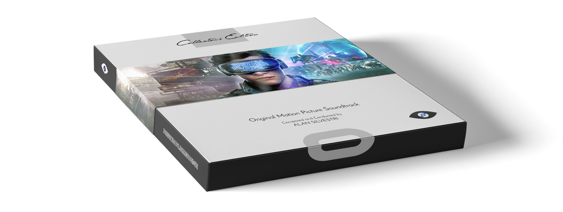
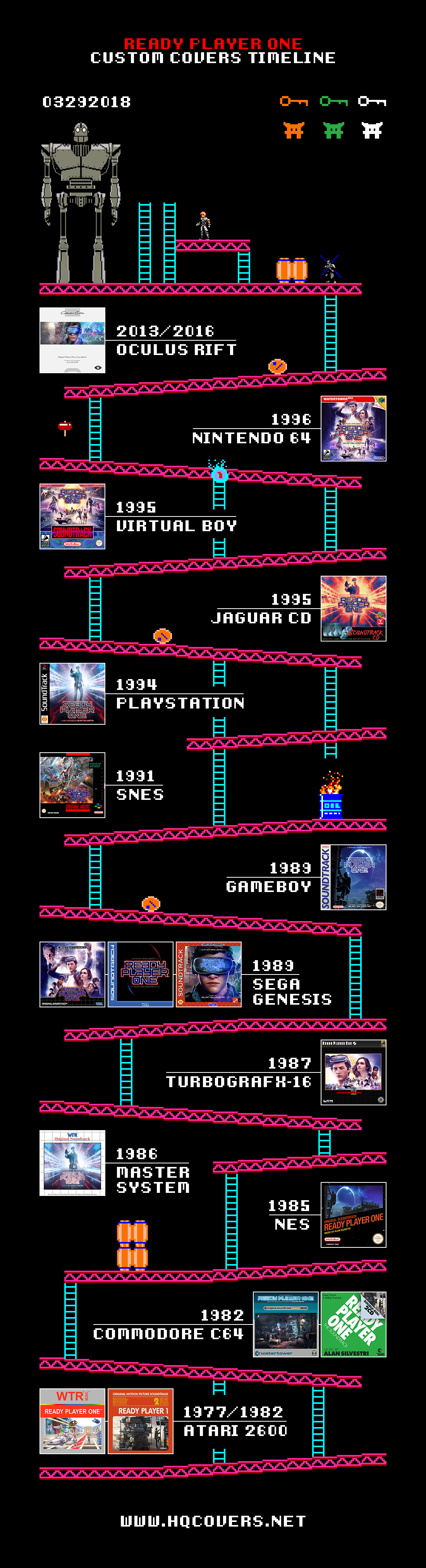
From time to time I come up with special advertising graphics to help promoting my custom covers on various social media channels, The following console gaming timeline was made for Ready Player One:

Bloody hell, they’re all gorgeous! Part of me says, i don’t see the point; but another part says, shut up and keep admiring them.
LikeLike
I guess the point is the fun in making and looking at them.
LikeLike
Reblogged this on Admissions and commented:
It’ll be hard to pick one, cause they’re all magnificent!
LikeLike
Wish there was a ‘rotate covers’ option, cause I want to use all of them!
LikeLike
I sometimes assign each track of an album a different album cover. It’s fun to figure out which artwork fits what track.
LikeLiked by 1 person
Good thinking, I’ll give that a whirl.
LikeLike
Absolutely brilliant work sit! As a child of the 80s and 90s, these really hit home 🙂
LikeLike
Noooooooooo! Not ‘Pacific Rim’ to coincide with the release of ‘Pacific Rim: Uprising’?! D:
Other than that, your designs are stil great. :)
LikeLike
Sorry pal, but I’m just not feeling it atm.
Try these for now:
https://blackinkcovers.wixsite.com/custom-covers
LikeLike
I just saw Ready Player One and thought HQCovers has to do some designs for this Soundtrack and as usual, I wasn’t disappointed. Excellent work!!
LikeLike
Thank you, stranger. Your words of praise mean a lot to me.
LikeLike
[…] Deluxe Editions. Still a little whacked from my previous (and once again sprawling) work on Ready Player One I accepted, partially hoping that a labor effort like this one would bring back some of my sorely […]
LikeLike
[…] series for Bohemian Rhapsody came to me fairly early, sometime in spring. Especially after all those tribute frenzies of the past and also because I’m a die-hard Queen fan since 1989, when me […]
LikeLike