With recently releases The Last of Us and World War Z, I was once again in my annual zombie fever. So I thought, it was the perfect time to make a few covers for one of my all-time favourite James Newton Howard scores: I Am Legend. The 2007 film, directed by Francis Lawrence, wasn’t received that well by critics, but I fell for it immediately. I’m a sucker for apocalypse movies/books/games in general. And the mature approach on such serious topics like loss, lonelyness and guilt was a game-changer for me. Although there’s a huge amount of silence in the film, James Newton Howard’s music was the final touch on the cake.
I remember to have searched for source material a few years ago, unable to find anything useful. So it’s kind of a surprise for me now, that I ended up with a such a big collection of finished custom covers.


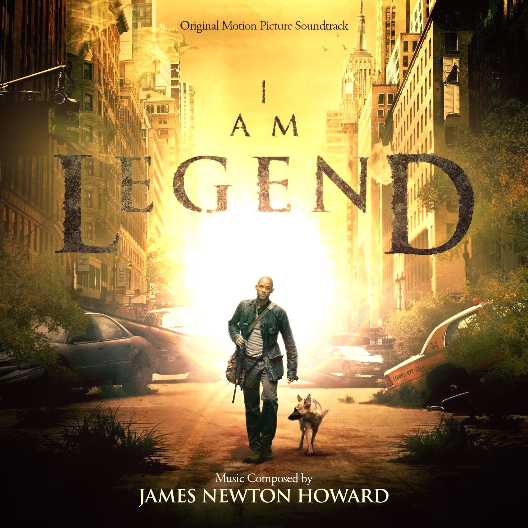
I always loved the official artwork (#1) for this soundtrack with it’s warm colour palette and detailed execution. My goal for this series was to live up to that quality with every cover. With this premise in mind, some of my customs took for-freaking-ever until I could finally approve them. With ultimately 102 image files in my Dropbox folder, I think this might be my most ambitious cover series so far.
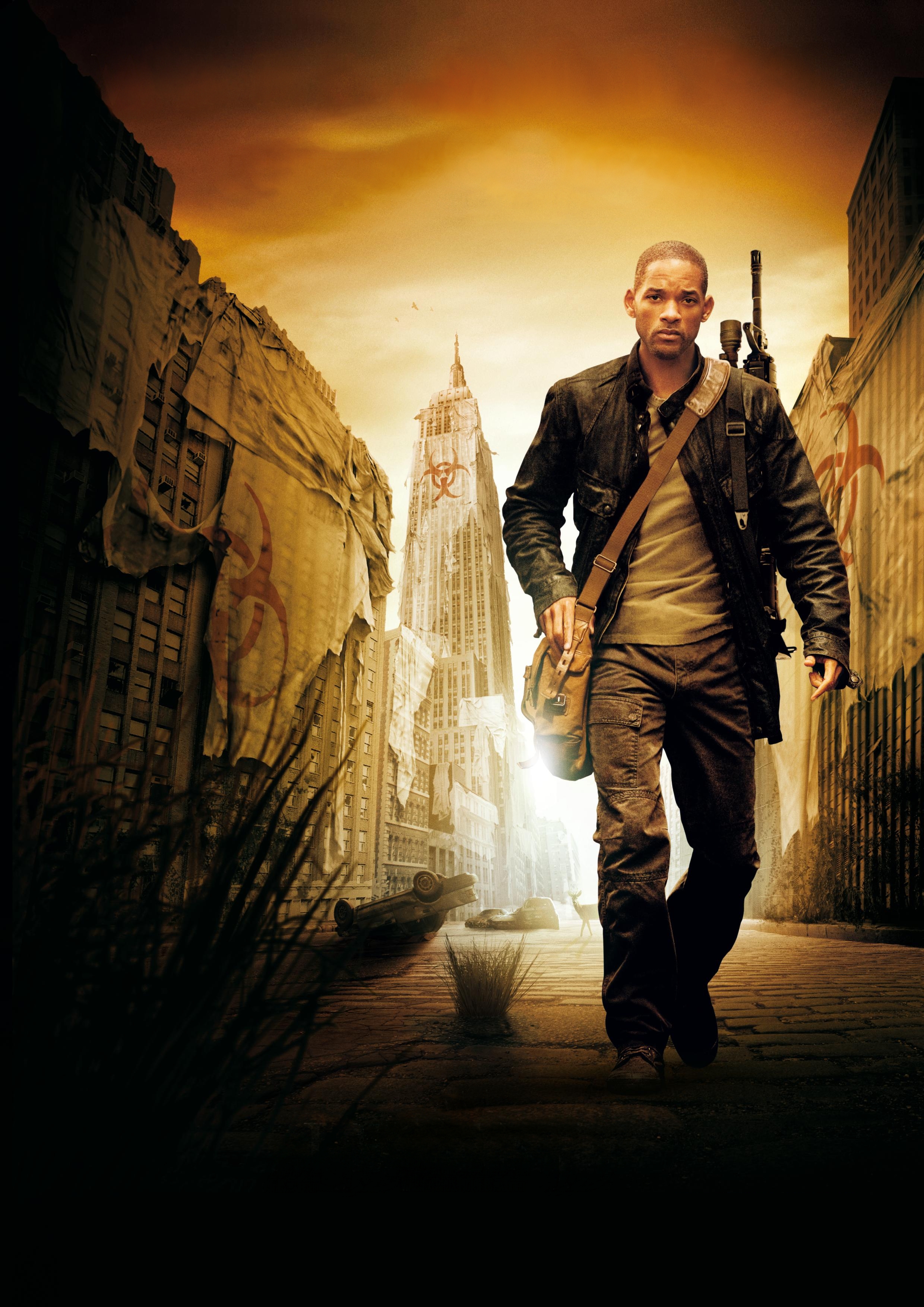
The first custom (#2) was a really complicated composition of multiple images. I had to overlay a low resolution widescreen wallpaper with a hi-res portrait poster and then merge them together sutureless. But the real problem was, that the colour temperature and contrast levels were totally off, meaning for me to tweak and adjust image settings for hours. It was grueling, but the perfectionist in me kept pushing forward until finally eveything was in harmony.
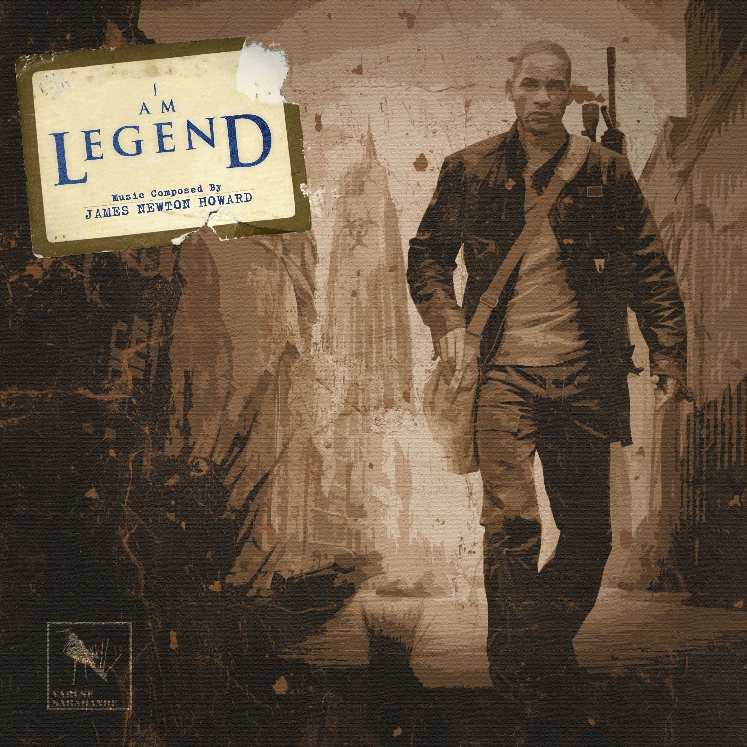
On custom cover #4 I was struggling with the film logo for a while. No matter how much I fiddled with saturation and contrast, it just didn’t work. The end result now looks like it was overgrown with weeds, matching the scenery. This wasn’t on purpose, it just happened by coincidence as I was frantically combining and duplicating different filter effects. I love it now though! The lens flare effect is totally 90’s, I know, but I rarely use it and I needed some ambient light to make the whole cover consistent. At least I did care about it a lot and made six different versions of lens flares, only to be able to select the best one – which I hopefully did.
The following custom covers I would refer to as the alternative bunch. Source of inspiration were either wallpapers (#5), teaser posters (#6) or alternate key art (#7).

")

Once again within this series I had to meld several images into one (#5). This time I replaced the whole background with a completely different, colour-corrected sky texture taken from Google. It’s a design I wanted to do for a long time and the end result is very near to my imagination.
The digipack cover (#6) on the other hand wasn’t planned at all, but arose from the fact that I did not know how to properly place the movie logo within the artwork. In the end I found a way (#3), but at the same time was sitting on many alternate designs sketches. So I decided to – for the first time – use one single template for two entirely different custom covers. I hope you like what you see here. The digipack kept me busy for a few days and I let myself go quite a bit, trying out many different variations.
The third gallery within this post is dedicated to all the DVD and Blu-Ray covers and templates.


#8 was a total nut-job. I had to break one of the most important design rules ever, namely the stretching of images. With a portrait poster as a template I just couldn’t crop out a square image for the sake of it without losing too much space vertically. So I had to bite the bullet and stretch the area to the left and right of Will Smith. Funnily enough, this resulted in a kind of fish eye effect that wasn’t even that inappropriate with him being the last man on earth and so on… you know.
The last two customs differ only in minor details. The first one (#9) may not be as crisp and clear (I had to trick a little), but it’s symmetrically right and the logo in the middle has just the right weighting. I prefer it out of these two, although there are a few artifacts in the image. The second one (#10) on the other hand, well I had to horizontally compress the letter “D” to make the movie logo appear in the center of the artwork. It’s not perfect, but I didn’t have many options with the logo and the background being on the same layer.
With this entry I’m signing off for the summer. But I’m already looking forward to welcoming you again in the fall with many new (and some already finished) custom covers. I wish you all happy (Zombie-free) holidays!

[…] stuff, but I couldn’t quite figure out a satisfying design. Much like the cover series for I Am Legend, suitable source material was very little to none. So I put it aside and almost forgot about it, […]
LikeLike
[…] some certain custom cover, I switch to another soundtrack and keep myself busy. This time it was I Am Legend that brought me back on track. I borrowed the idea to feature the lyrics of the Firefly theme song […]
LikeLike