There’s a very interesting article on Strange Shapes about what we would’ve gotten, had Ridley Scott directed the Alien II sequel. Long story short, it’s basically Prometheus in a nutshell. And I also predict, we wouldn’t have seen and especially heard James Horner composing a rousing and frenzy score as he did for James Cameron’s Aliens. That would have been a real pity, since it may be my favourite James Horner score of all. And one that most certainly defined my childhood and its nightmares.
When I was 10 years old, listening to the vague descriptions from my brother and his friends (“It was so freaking awesome, when she battled the queen with her POWERLOADER… but you CAN’T WATCH IT, because you’re TOO YOUNG!”), in my mind Aliens grew into what must have been the best, badassed, hands down most awesome movie ever banned on celluloid. Based on the few snippets of information they granted me, I built LEGO Powerloaders, restaged whole scenes in my backyard and wondered endlessly what they meant, when they were talking about the “knife scene“.
Every once in a while I sneaked into my brother’s room and spyed enviously at the black, unlabelled VHS on which he recorded the movie during a late night TV screening (I still remember the other film recorded on that tape). And I waited patiently… waited for my chance to watch it. And then, one day, I finally did it. And it blew my childish mind!
With all that said, you may possibly understand the rush of nostalgia I’ve been in, while working on these covers. And my meticulous attention to detail, which peaked to new heights.

")


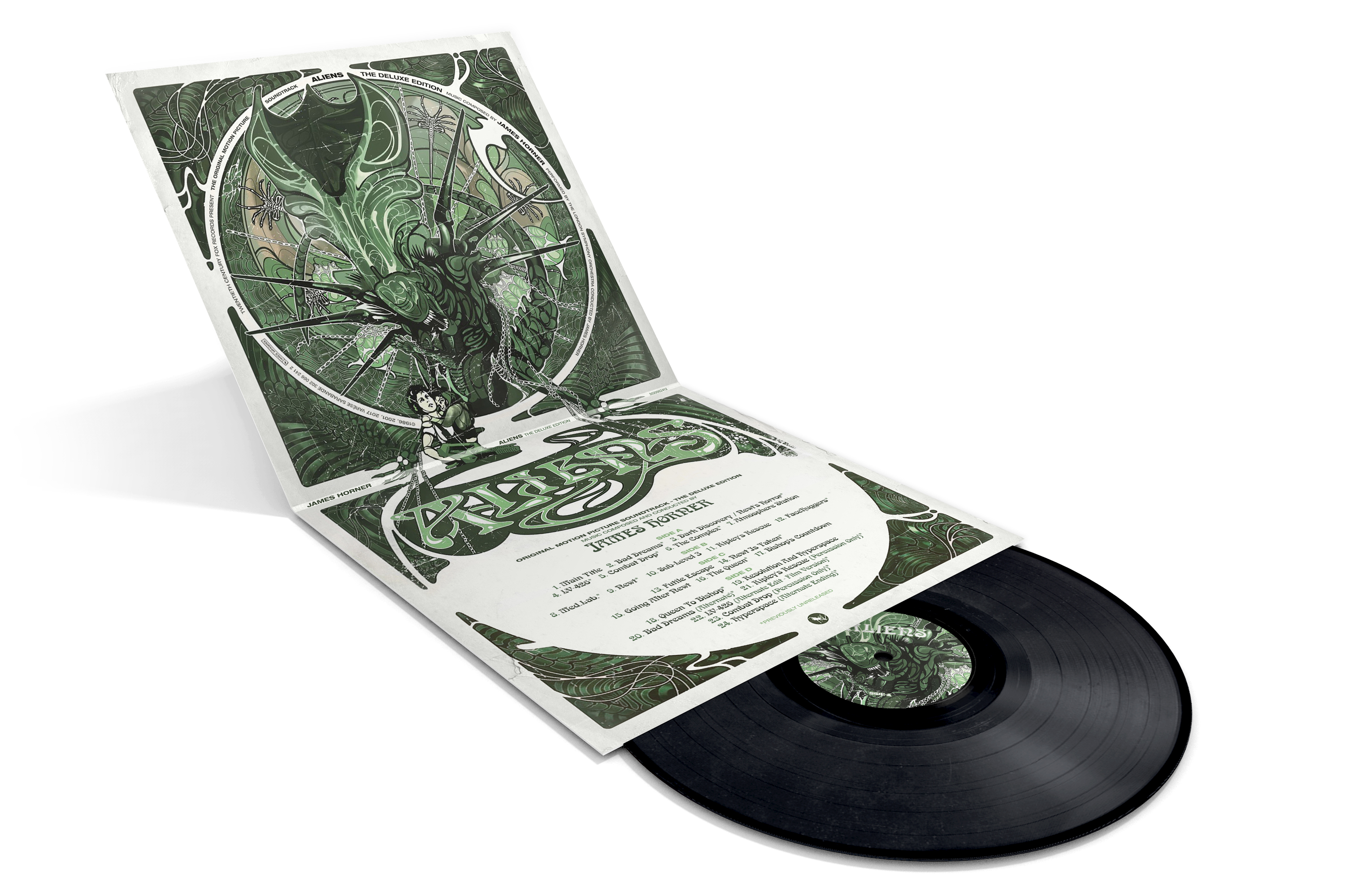
It was clear for me from the beginning that I would remake the original 1986 cover art of the Varèse Sarabande LP (#1). I wanted to have a clean and pristine version of it, which was nowhere to be found. Finding useful source material for it wasn’t easy either – maybe that’s also the reason why Varèse went for a portrait orientated artwork on their 2001 deluxe edition (#2). British music label That’s Entertainment Records on the other hand just put the film logo and nothing else on their vinyl version of the score. Nevertheless I remade the artwork upon request (#3) and let me tell you that, I had a lot of fun doing so.
There was some different material available though, which I used for two additional old-school designs (#4, #5). These two covers in particular were deliberately designed as if they had come out in 1986. Be it the chosen font style (“Goudy Heavyface“) or the lack of anyhing too fancy. I only post-processed the first one (#4) with Pixlr-O-Matic to make it look more like the opening titles in the movie.
Some people like to keep their digital music library uniform and therefore want to use matching artworks for every soundtrack from a film franchise. I’m not one of those, but I’m certainly willing to fulfill that demand. Custom covers #6 to #8 follow the design guide started two months ago in my post to Jerry Goldsmith’s Alien. Cover #9 in turn uses another reference, namely this custom cover for James Newton Howard’s I Am Legend. I really wanted to have at least one bright white custom within this series and a fantastic drawing by deviantArt user RobertoDS was perfect for that matter.
")
")
")
The trilogy of covers above (#11 to #13) features my favourite Alien illustration ever. All of these images were created by Denis Beauvais for Dark Horse Comics’ legendary Aliens Comic Book Series. I bought the limited hard cover edition only to have his amazing drawing in physical form. In fact all of Den’s work is nothing but stunning. He brings to life a whole galaxy of weird stories and scientific adventures revolved around Giger’s Xenomorphs.

The same image (#11) has also been used for another one of my childhood memories: Aliens – A Comic Book Adventure. Even though this 1995 PC render adventure wasn’t that great, I just loved it in all its technical botchery and absurd storytelling. I really think the expanded universe of Aliens is one of the most fantastic and rich in the Science Fantasy genre. And artists like Mark Verheiden or Den Beauvais deserve a lot of credit for that.
Maybe that’s also the reason why I primarily chose comic book covers as templates for the last gallery in this series.

")


 (Front)")
 (Back)")
I took a lot of time for detail work on these. For example the different colour gradients of the “I” in the “ALIENS” title (#14, #15). Or all the small vinyl logos I gathered up from various sources. Cover #17 was especially fun to do. Thanks to the huge size of the source image, I could get lost in various small details, like e.g. the subtle drop shadow of the film logo to make it look like a bad printing job (like in the 80s). Or the slightly translucent James Cameron signature below the title, as if the cover had been signed afterwards using a magic marker. Also, do you see the Return of the Jedi reference in it?
I’d finally like to thank the original artists of these templates (#14: Mark A. Nelson, #15: Raymond Swanland, #16: Den Beauvais, #17: Witold Dybowski, #18: Samuel Ho) and wrap up my custom covers collection with a vinyl mockup I wanted to make for a very long time. Samuel Ho’s custom Aliens poster lent itself wonderfully onto the square Vinyl sleeve canvas. Though I needed to overpaint and re-arrange a whole lot, especially on the back, all pieces fell into place perfectly in the end.
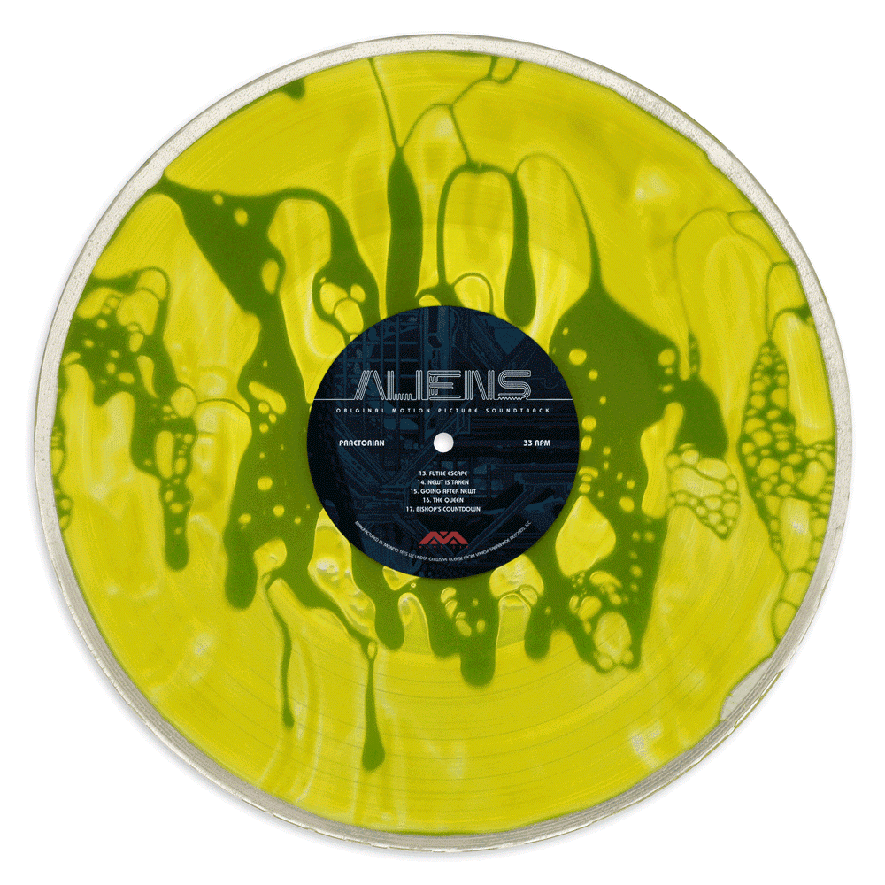
Closing up this entry is Mondo’s original vinyl release with artwork by Kilian Eng. This truly unique liquid-filled xenomorph blood vinyl was limited to just 75 copies and went out of stock literally in minutes, despite a minor (or major?) design fauxpass on the sleeve.
")
")
")

#14 is my favourite, although the title logo being that tannish-grey colour gets a little lost; did you try alternate colours? I can see why you’ve gone with the one you have, it works better with the colour tone of the artwork, but does risk getting lost. Overall though I think its superior to the others, and as a bonus it matches your retro Alien design that I loved very well.
Aliens always had a problem with singular images for the poster and album, and later designs for the film on VHS and DVD etc. I don’t like the image Varese used, never have. Just seems one of those films where the marketing team never really nailed the poster art. Some films are tricky I guess. I had the James Horner score on vinyl back in the day (I was a huge Horner fan back then, buying nearly every score of his as it came out). While I enjoyed the Aliens score, I never really loved it and never upgraded to CD, and don’t know what happened to the album. To be honest, as an hardcore Alien fan, I hated what Cameron did, turning it into Rambo In Space and the perfect killing organism into a dumb horde of canon fodder aliens led by a Queen Alien has always got my blood boiling. But each to his own- seems when you were a lad it was the right film at the right time (for me, it was Blade Runner- which raises my question, did you ever design covers for that score?).
Do you build 3D mock-ups or are they clever photoshop pictures masquerading as real objects? They look cool as digipacks.
LikeLike
I think I tried a few colours but I don’t remember really. These covers were for the most part made over one year ago, so go figure.. ;-)
Blade Runner’s on my to-do-list already, but I haven’t got round to it really. It’s also one of those films for me, were there is no “definite” poster art.
The 3D previews are Photoshop templates which I apply my designs to. They’re not real, but I love them. I’m constantly looking for more, which isn’t as easy as it sounds.
I’d like to thank you for commenting! I was hoping you’d return when I post this series. And I’m already looking forward to your thoughts when I go online with Alien3 and Resurrection as well. Oh and Prometheus is on its way too :)
LikeLike
This is another great series! You always go to such lengths and it is appreciated by us who love these things!
One quick question – the TER vinyl release for Europe had a similar cover to your #3, only with smaller fonts (and the TER logo in the corner). Is there any chance of you replicating this design as well? Would be wonderful if you could, this was the LP version I had and it would be super to have a hi-res version in my digital collection.
Thanks again for all your incredible work!
LikeLike
Post updated! :-)
I remember that design from my web research.
Don’t know why I didn’t remade it in the first place, because I actually really like it (well I love the Aliens logo, so that’s no surprise). Plus, those old 70s and 80s vinyls just look so damn sexy, I can’t get enough of them.
I sometimes wonder if the designers back then thought of their designs as being contemporary or maybe even futuristic. I bet they had no idea of what an impact they would leave on their future generation (= us). Which leaves the question, are we doing the same right now, without even knowing?
LikeLike
Absolutely, shockingly superb! I’m so happy you made this one! That era was a golden age for vinyl design, I can’t believe I could stare at a cover that had virtually nothing on it for hours and hours!
Many thanks to you! Looking forward to more.
LikeLike
[…] because I was afraid of not being able to do it justice. I’ve put so much effort into this or that covers series, that I sometimes find it hard to raise the bar. But this is Star Wars, the mother […]
LikeLike
[…] 2016 vinyl release. The artwork was created by Kilian Eng, who delivered a similar design for Aliens the year before and also Alien this […]
LikeLike
[…] from Stockholm-based illustrator Kilian Eng, who already designed Mondo’s Prometheus and Aliens. I really can’t wait to see his work for Alien³ – if Mondo decides to continue this […]
LikeLike
[…] dark and infinite. I simply fucking love those deep blue-and-black colour palettes in Cameron’s Aliens, for example. For many, this means the ultimate nightmare, but for me it’s like a dream […]
LikeLike