In April of last year I was contemplating the future of HQCovers. I’ve stated some ideas about redesigning and restructuring this blog. Or the possibility of offering custom covers beside my professional passion for soundtracks and scores. However my most wanted addition would be guest entries. I’ve come to know a lot of talented people over the past years, who deserve to be spotlighted. And it’s my pleasure to take a backseat for once and leave the stage for one of my favourite artists. He’s a fellow Austrian, he goes by the name rotane and he’s an absolute whiz with font design.
When heidl asked me to appear as guest on his blog, I felt quite honoured – and also a little terrified: After all, his custom covers are amongst the best on the net, so I knew I couldn’t just submit a random cover and be done with it. No, it had to be something special.
I ended up making a series of albums that aren’t all that well known. Plus, the original covers lack any sort of artistic value. No offence to Queen Margrethe II of Denmark who was responsible for the cover illustrations, but the overall cover designs really are as uninspired as they get. So let me present to you my take on the Complete Songs & Poems by The Tolkien Ensemble.
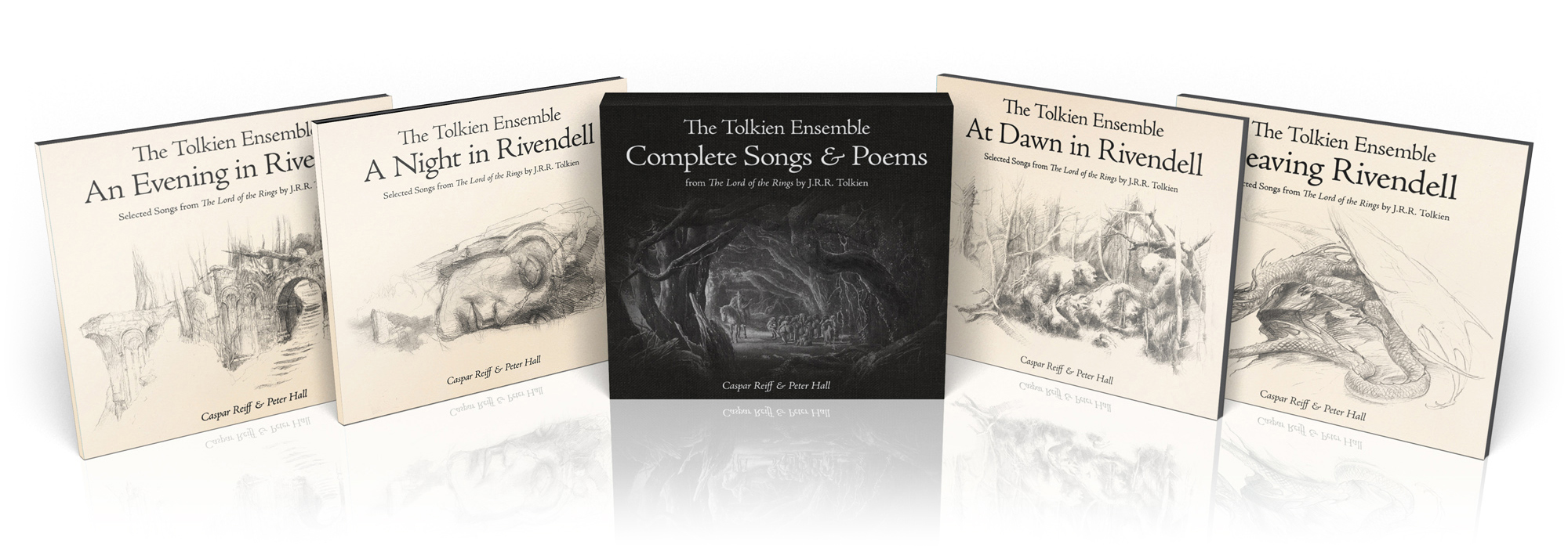
I wanted to make a set that was both harmonious and atmospheric, and should convey a sense of quaint grandeur, but nothing too fancy. A book cover that immediately sprang to my mind was “The Music of The Lord of the Rings” by Doug Adams. This cover served as the basic template for all the necessary elements: A prominent typeface and a simple pencil drawing. I also knew I needed a background textue to give it an aged look and make it appear more tangible.
For a cover that is as minimal as this, a lot of attention has to be given to the typeface. After a lot of testing, my choice landed on “Adobe Jenson“. It’s a “Venetian old-style” type of serif font – a classification that dates as far back as the 15th century – which perfectly conveys that sense of old-world quality that I was going for.


Picking the right set of drawings took almost as much time. Using the sketches of veteran Tolkien artist John Howe was almost a no-brainer, but finding the right ones at the right sizes proved to be more difficult than it sounds. For a few, I had to fall back on an old book that I bought a long time ago and copy a bunch of them from there. Importing them to Photoshop and finding the right blending settings ended up being relatively easy. I set them to multiply and applied a levels adjustment layer for each of them, so I had complete control without degrading the quality as I continued tweaking the settings.
Finally, the background. I didn’t want an obvious parchment-style texture, but it shouldn’t be plain white either. I mixed together a couple of paper textures and colour layers until I had what I wanted.

For the fifth CD (which is a compilation album of all their previously released songs and poems), I made an alternate cover in near-black to reflect the style of the official artwork. The background mimicks that of black linen, to get a visual connection to the other four covers.
And as a bonus, I made a second set. This one does come with a parchment texture and a font that is reminiscent of handwritten text. The font is appropriately called “Brandywine“, but predates the movies by almost a decade.


Interested to see more of rotane’s stuff? Please visit one of his many homes by clicking the links below.
rotane home
rotane on deviantART
rotane’s custom album art gallery

Well, there is not much to add for me, other than to say it was my distinct pleasure!
LikeLike
Nice work!
LikeLike
[…] logos from scratch and I’d like to take this opportunity to express my deep gratitude to rotane, who was an invaluable resource of help! Without his font expertise I wouldn’t have been […]
LikeLike
[…] Also, I need to mention these covers wouldn’t have turned out as good and it would have taken me a lot longer to make them if I hadn’t received the logos for Empire and Jedi made by heidl and rotane. […]
LikeLike