Michael Giacchino’s triple pack of scores concludes with Inside Out and I have the feeling, that this will be his best work out of the three. Given Giacchino’s past with Pixar and the highly creative premise of the film, I’m hoping for an emotional rollercoaster ride. A story revolving around joy, sadness, fear, anger and disgust might be the perfect opportunity for any composer. But with Giacchino Pixar wisely chose the perfect man for the job. Just listen to Up and you’ll know what I mean.
The ad campaign for the film had a very nice set of colours. It’s cheerful but not oversaturated. Just the right balance. And also the design of the emotions themselves is very visual. Overall this is a clear winner in my eyes and I enjoyed every second working on these covers.
Beside the customized title logo all text elements were based on the classic font “Futura” (in Medium, Bold and Black). Its simplicity forms a welcome contrast and calming anchor against the rather chaotic ensemble of cast and colours (#1).
On #2 and #3 I had a bit of trouble to place the bottom text line, because of the equally white and black background. I tried a few colours at first, but it always distracted from the main image. The black area was too small to place the text inside of it. And putting it into the corner would have ruined the overall composition. Finally I went with an inverted text, because it seemed to be the most obvious solution to me.
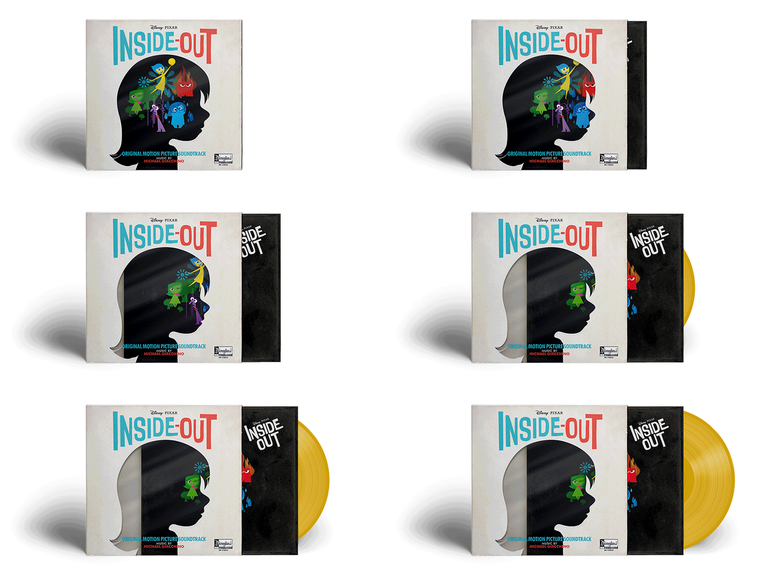
Custom cover #6 was the only real challenge within this series, but I love how it turned out. I used this international poster as a template and at first only intended to make a variation of #3. So I customized the title logo and rearranged everything. But the textured background suddenly made me think of an old Vinyl record and I was immediately sold. The idea for an inner and outer sleeve came during the creative process and this time it’s only natural. After all you have a motive of the main character’s head and her emotions inside of it. Why not set them free? I added a lot of texture on this one to get visual depth and also a clear film texture, because otherwise the placement of the bottom text physically wouldn’t work.
 With a record sleeve like this one, Riley’s emotions would be under your control and it’d be your decision whether they are Inside or Out ;-)


Gosh, this is fantastic! I love them all. I’m very curious about what you would do for Monsters Inc. or Toy Story movies.
LikeLike
[…] I clicked “Browse by Composer” and chose Michael Giacchino. After the delightful section on Inside Out, I went back for more art for Giacchino. I had a look at Star Trek and one cover really caught […]
LikeLike