Creating custom covers is not only for providing alternative artwork for digital media files or CDs. It’s also a form of ovation. It’s appreciation of music, art and overall beautiful imagery in every detail. A very passionate adventure. And I’ve recently read a story that perfectly captured that essence. A personal experience report of how daunting, challenging, and ultimately rewarding the making of a custom cover can become.
The following custom cover and its origin story is by Final Fantasy Shrine Forums member “GlassButterflies“. And it really made me ponder over all the energy and commitment so many artists are putting into their works, without hardly anyone noticing or acknowledging. Every single piece of art has a journey behind it. This is his.
I’m delighted to present you the first guest entry on HQCovers.
Hello everyone! I’ve been frequenting the Final Fantasy Shrine Forums for a long time and I have to say that the custom covers thread is my absolute favourite on the site. It provides a great tool to people such as me, who love to meticulously organise their iTunes with the best-looking covers, but more than that it has been awesome seeing the progression of new contributors as they first test the waters with their photo-editing skills, going from simple covers to works of art. Unfortunately, this has the side effect of making one incredibly jealous. “How come these guys are so great at making album covers, but I’m not?”. Well, summer holidays are here and instead of spending all of my free time lazing around playing games and watching movies I’m only going to spend most of my free time lazing around playing games and watching movies, and spend some time learning how to do this “custom cover” thing.
Forgive me for the long post to follow, but seeing as how this is the first cover I’m posting to the shrine I feel like recounting the tale of its creation will prove cathartic for me given how challenging it was. I had a couple of trial runs with GIMP (I heard it was free so I jumped right on that), but for my first real project I decided to tackle a score I haven’t seen anyone make a custom cover for yet. One which I feel deserves a better cover than what it got. Pirate’s Passage by Andrew Lockington.
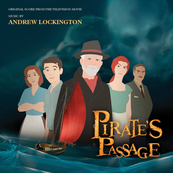
The problems I have with this cover come down to what I personally believe an album cover should be. It should be visually appealing and stand-alone, while at the same time giving only a general idea of what the story is about. Generally, covers that convey the mood, tone, setting and location of a story I feel are more important than the characters in that story, although there are exceptions to this rule. For that reason, I feel the laziest album covers are those that just use the main movie poster with all the famous actors standing in a row looking off into the distance (again, there are exceptions where this turns out fine).
As such, you can probably see where my problems with this particular cover stem from. Granted, it’s got a backdrop of a ship caught in a stormy sea with an ominous Death Eater-esque cloud in the distance. That’s pretty good! Unfortunately, this cover commits the cardinal sin of overlaying that nice background with a bunch of characters I don’t care about. I haven’t seen this film, therefore I don’t know anything about these characters. They don’t strike a cord with me, and they’re not doing anything particularly noteworthy in terms of pose and posture. It just gives off a general impression of a cheap animated child’s film (I haven’t seen the film, so maybe it is). But the front cover of an album should be about the music, and the music shouldn’t be held down by the film it accompanies! Especially for a film I haven’t seen, the music should stand apart from the film, telling its own story. A good album cover helps achieve just that. So, that’s what I set out to do!
Follow me on my adventure as I chart the treacherous waters of custom cover making!
This was probably a poor project to start as my first since the somewhat obscure nature of the movie made finding promotional material quite difficult. My biggest problem was that I never found the movie logo separate from the source material. Unfortunately, while I will definitely use the advice you’ve all been kind enough to give me for future covers, it didn’t help me for finding a logo for this one. So I hard to resort to the second-worst-case scenario: find the highest-quality promo and cut the logo out from that. Funnily enough, the highest quality material turned out to be the OST cover (which proves how little promo material there is).
Next came the hard part: cutting out the logo.
- 15 minutes of researching which GIMP tool is best for cutting it out.
- 10 minutes experimenting and finally deciding what tool to use (finally decided on fuzzy select tool).
- 20 minutes using the tool to try and cut the logo out perfectly.
- 10 minutes to realise “haha no, it’s never that easy” and compromising by cutting out all the logo + some background.
- 1 hour erasing the background as close to the logo as possible.
- Going to dinner. Coming back and pasting the logo onto the background I want to use.
- 30 minutes of 5 minute intervals going back to erase more stuff from the background I missed because it wasn’t visible until I pasted the logo onto the background.
- 5 minutes of actually typing the text for the cover, deciding on the font and the colour.
Phew.
Actually, the part that I thought would be the hardest – finding a nice background image suitable for a cover – turned out pretty simple. I found some beautiful hand-drawn paintings for the front cover of the book the film is based on and decided to use this one because
- it is minimalistic while still containing the important elements of the story (the skull, the ship, the captain)
- it tells you very little about what the story is about, and
- it remind me of the front cover of a fantasy book I would find lying around in a bargain bin at a local library which, considering the story is set in Nova Scotia 1952, I thought was quite appropriate.
As for the font, I pretty much just copied the text and layout from the OST cover but changed the font to give it more of that “bargain-bin fantasy book” feel that the background was trying to capture. Funnily enough, by going for this old-book feeling, the film logo which I spent so long trying to cut out actually looks a little too modern and out-of-place, but I spent roughly two and a half hours on the dang thing, so stay it does.
And so, with much ado, here’s the final product!
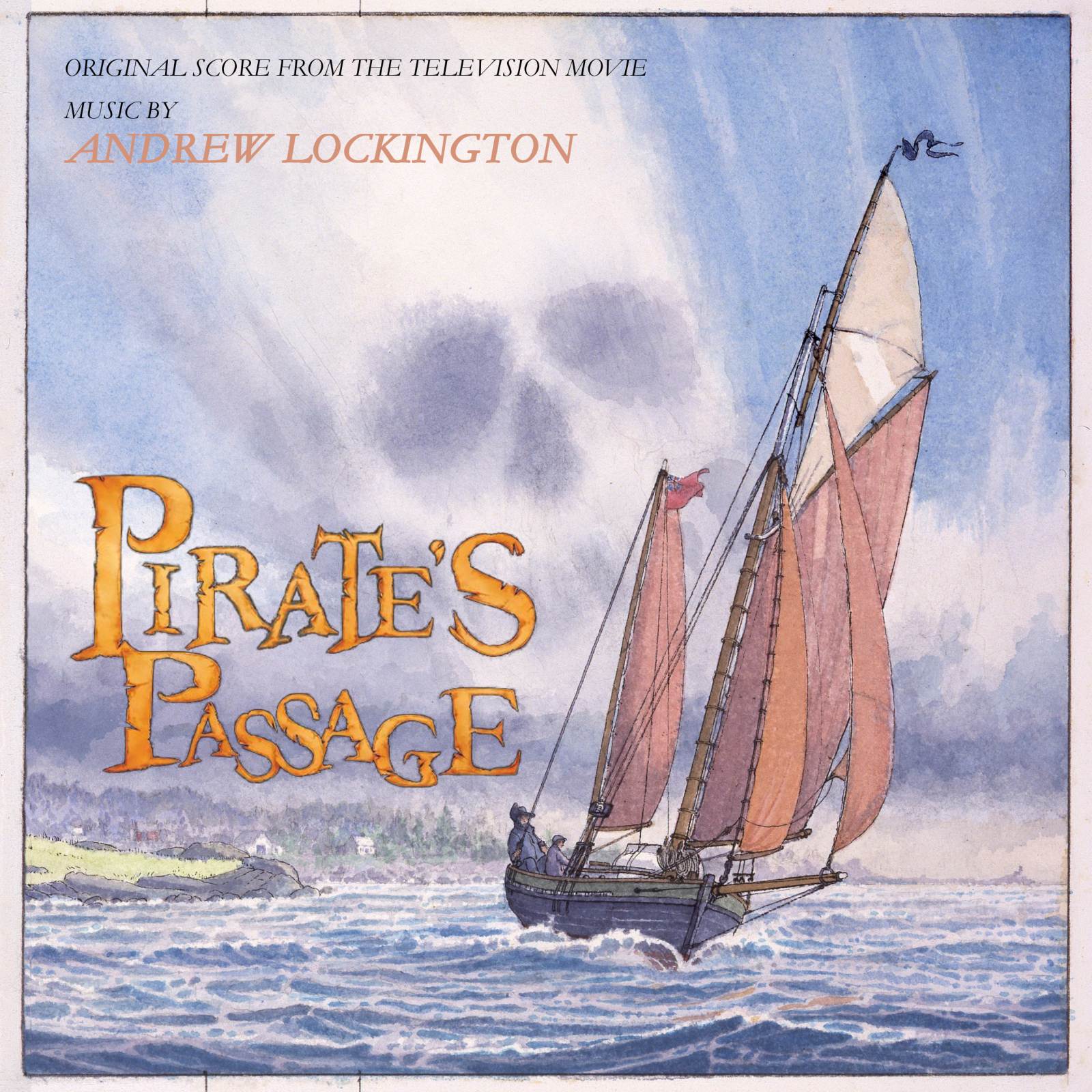
I’ve gotta say, I quite like how it’s turned out. It takes a lot of willpower to not reopen the program and fiddle with the text, the colour, the font, the placement, etc. Even those black bars at the top and bottom of the image I considered going back to erase, but I like that rough feeling that it gives to the whole thing, like the cover itself wasn’t made in GIMP but hand-made. I’m well aware there’s probably several areas which I need significant improvements in, so don’t be afraid to give feedback. I want to learn! And yes, I probably won’t become the next heidl, but if I can give back a little bit of the joy the wonderful contributors of this thread have given me, well that’s alright by me.
Hope you enjoy!

I enjoyed reading about your creation of your custom album cover. What a beautifully thought-out concept and splendidly written article!
LikeLike