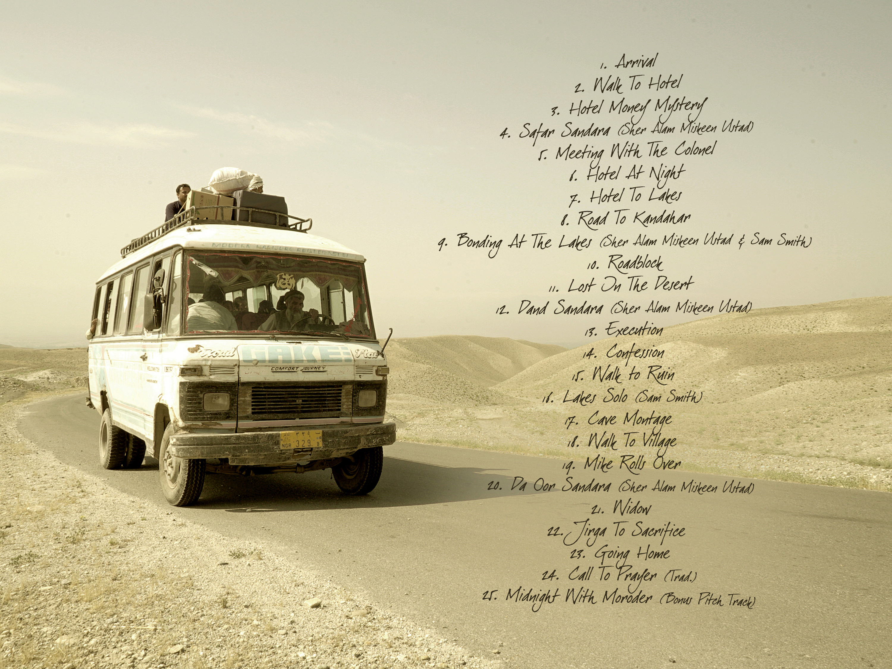
An early version of the tracklist page from the digital booklet. I played around with the font, twitched and twirled it to make it even more natural looking – unfortunately at the expense of legibility. This was one of those cases in which I desperately wanted to bring some graphical flamboyance to the scene, without realizing that it’s not the flourish that should stand out, but the main motive that represents the film! It wasn’t my job to draw attention, but to rather enhance what is already there.
