I‘ve read an interesting interview with Marco Beltrami the other day in which especially one quote of him stood out for me and made me think. On the question, whether he thinks that genre movies and scores would stick out if they were as offbeat as Snowpiercer, Beltrami said the following:
Well Im not sure what the “genre” is for “Snowpiercer,” but yes, if every movie was an original idea and was focused on creating something new rather than imitation, than they would stick out! Even if a movie doesn’t completely work (which is not the case here), it is better to strive for greatness and innovation rather than to repeat someone else’s work.
I’ll take this one now literally for once. “It is better to strive for greatness and innovation rather than to repeat someone else’s work”. What does this mean for us custom cover artists? While I generally agree with his statement, I’m a little bit caught in the middle here. I mean it’s obviously one of my major goals to turn a films key art into appropriate album art. Just for the simple fact that I want my customs to look genuine and authentic. I also try to come up with alternates, but the main task and source of joy is in using existing material. So, is this the right way to do it or would you prefer completely original designs over designs containing official studio art? I’d appreciate some opinions, thank you.


Marco Beltrami’s Snowpiercer was originally only released in South Korea by the CJ E&M Corporation (#1), when finally Varèse Sarabande took a heart and made it available to the rest of the world one year later (#2). While the Asian release (as always) got a tasteful cover artwork, Varèse threw together the usual headshots and didn’t even bother to use a square image for the front cover. They just added those odd black bars and called it a day. Way to go, Varèse!
My custom cover gallery starts with two artworks, that were actually designed by a colleague of mine, The Score Designs‘ master of brushes, Bugz. I remade the first one (#3), because I’m a perfectionist and my source image was a few pixels wider than his (…). The second one (#4) was perfect indeed and I added it with his kind approval.
Following that comes an image that always quite struck a chord with me (#5). I can’t tell for the film as I haven’t seen it yet, but this dense picture of the Ed Harris’ antagonist character transports the mood of the music perfectly for me. I tried to further grade it up with a classy approach and hopefully achieved it.


With a change of scenery we leave the eponymous train for once and shift outside into the post-apocalyptic ice age of Jacques Lob and Jean-Marc Rochette’s graphic novel. Based on the recently released French Ultimate Edition Blu-Ray I’ve cobbled together a rather straightforward design (#6), including two additional variations (#7, #8).
(Caution! Technical gibberish upcoming!) You may have noticed, that the title font design so far was all over the place. Beginning from the unmistakeable “Bank Gothic” (#3) over a slightly modified mix of “Haettenschweiler” and “Compacta” (#4) to the elegant “Neutraface” (#5). Having used that variety of typefaces I found it a little disappointing, that they released the Ultimate Edition with “Bank Gothic” all over it. Considering that it’s used by everyone and his brother nowadays. But – and now I’m coming back to my opening controversy – this was the designer’s official choice and, as pedestrian as it may be, it’s still genuine and original. So I jumped the bandwagon and went along with it. And in all honesty I have to admit, that it goes well with the sleek and futuristic renderings of the Snowpiercer anyway. At least they attempted a little bit of logo design and cropped some of the glyphs. Redemption came in form of the next cover (#9) and it’s typographical treatment in style of the films moody opening credits.
I almost wrapped this series after custom cover #9, ending it in classical fashion with a low-key minimal art. But… this train hasn’t left the station yet.
")

")
")
This is where the fun part starts. I found a near perfect shot of the trains “perpetual-motion engine” and conceptualized a Limited Signature Edition™ (#10). The idea was to come up with a label-independent soundtrack series, in which certain composers introduce selected works of theirs. All wrapped up in a neat and nifty packaging design – including the real(!) signature of the respective composer. I’ve saved a Photoshop template and may revisit this series in the future.
The next stop would be my take on the South-Korean version of the score album (#11). This was actually the very last custom I made for Snowpiercer and I think it shows. I derailed a bit… I almost scrapped this one and I’m still not so sure about it, so… you’ll be the judge.
The single cover for “Yona’s Theme” (#12) was more or less born out of necessity. I had found another landscape shot from the movie, but didn’t want to go the same route again as before (#7, #8). So I studied the tracklist and came up with the idea of a promotional single release for western markets, hence the Varèse logo at the bottom. The final track came to mind easily. As album closer and thematic highlight of the score I assumed it would justify a stand-alone release like that. I don’t know if Snowpiercer is the kind of film or score that deserves that kind of merchandising and – let’s face it – it’s make believe anyway, but I guess it works within context and gave me a reason to create something different. From the designers POV this one resembles those promotional web-posters from the official website.
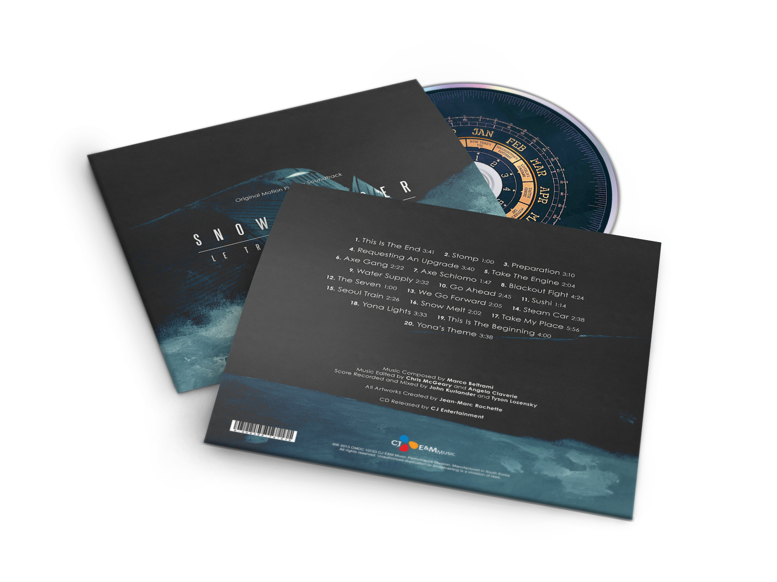
A few days ago I went to expense and purchased a new set of Photoshop templates for some CD and Vinyl sleeve mock-ups. I was so happy that I immediately started to draw out a full sleeve artwork (#13) for my current project. Its design is entirely based on the concept art book from the earlier mentioned Ultimate Edition. And because of that fact it features a drawing on the cover rather than actual images from the film. So I named it Legacy Edition – in reference to the recently released The Lion King soundtrack – and because it sounds cool. The motive is by Jean-Marc Rochette, original creator of the graphic novel. Please have a look at the finished mock-up in the image below and – for the first time on HQCovers – download the backcover in high resolution as well.
Sorry for all the bad puns. I just had to come up with at least a few of them. I know they were bad, but hey… I’m not Michael Giacchino, you know.

[…] funnny, at other times quite thought-provoking. It takes the same line as Bong Joon-ho’s Snowpiercer and couldn’t be any more relevant these days, even though the literary original is over four […]
LikeLike