Ben Wheatley’s new film High-Rise is a highly stylized, urban dystopia. A parable of greed and class society, at times chockingly funnny, at other times quite thought-provoking. It takes the same line as Bong Joon-ho’s Snowpiercer and couldn’t be any more relevant these days, even though the literary original is over four decades old. It is also a prime example of a music album I was immediately interested in solely based on its eye-catching artwork. Of course that statement was only true until I got to know the man behind it… Clint Mansell.
I’ve always been a fan of his music – after all I dedicated my very first blog entry to his amazing score for Moon. His body of work includes a wide range of creative and often times unique scores, yet always – thanks to his roots in popular music – with a focus on the overall listening experience. High-Rise is the perfect example of this. Its colourful 12-track album presentation shifts from beautiful to quirky to treacherous and back. And it was wrapped in the most wonderful retro-futuristic package (#1) imaginable.


For the promotion campaign Empire Design released a poster that looked like Stanley Kubrick’s A Clockwork Orange and The White Stripes’ Seven Nation Army had a brainchild. And it was this poster that once again made me go and fire up Photoshop. My first idea was an obvious one: Redo the High-Rise soundtrack in style of the old album art for A Clockwork Orange.


What startet out as a finger exercise for another idea turned into an exceptionally well imitation of Wendy Carlos’ 70’s classic. Using the font from the Kubrick flick (“Timepiece“) I was able to recreate the style of the original logo. Furthermore I added some additional spice by rendering all supplemental texts in the gorgeous retroesque “Peignot” and “Yellow Magician“. Just have a look at those stunning serifs in Clint Mansell’s name. I absolutely love it!
And now my above-mentioned other idea.
")
")
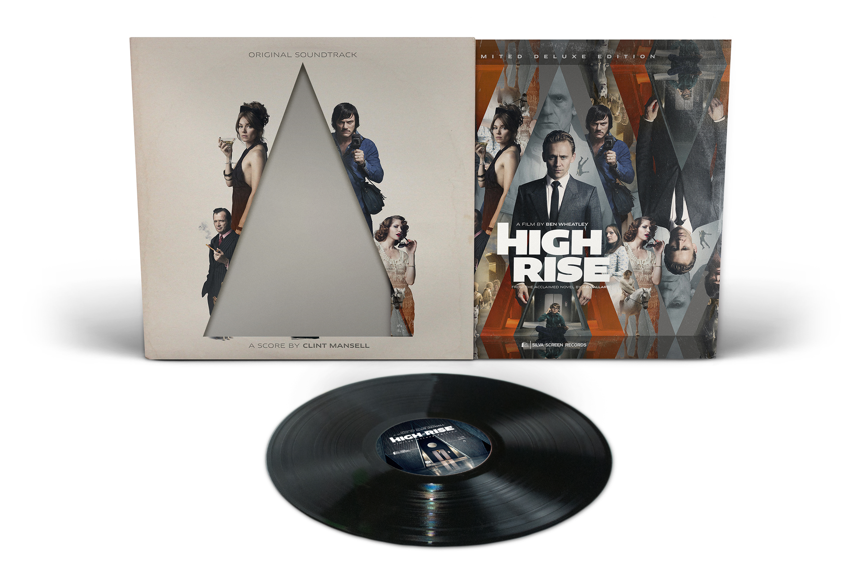
This fancy Vinyl design with its inner and outer sleeve was my main motivation behind this cover series. It was an immediate thought as soon as I saw the official posters. But before I was able to put my plan into practice, some things needed to be done. At first I had to extend one of the posters in width by copying, re-positioning and mirroring the original poster. Actually quite enjoyable (my OCD was pleased), but also a little cumbersome:

I also wanted to maintain the typography treatment of the original logo, but unfortunately did not have the necessary font (“FF Clan OT“) and was not willing to buy it just for this one cover series only. But thanks to the generous liberties of Web 2.0 I could just type in my desired text into Typecast, take a screenshot of the preview image and paste it into my cover template. Inelegant? Yes. Morally reprehensible? Quite. However highly useful for my hacky purposes and much more affordable than the real thing. Though I admit that’s no thing I’d practise on a commissional work, so don’t worry, future prospect!

Kerning really is a lost craft these days. “HIGH-R ISE”. Breaks my heart when i see this!
Oh, but i DO like your covers (numbers 3 and 8 in particular), and new music by Mansell is always appreciated.
LikeLike
Omg, you’re right! Man, you are really testing my typography abilities to the limits… give me 30 minutes.
LikeLike
It is a curse, i’m telling you. And thanks to retina displays, it’s only easier to spot.
(Also, i didn’t want to comment negatively on YOUR typography abilities, but the official logo. Excellent that you’re willing to fix it!)
LikeLike
Oh I’m glad you did. And I’m afraid I’m gonna have to involve you more in my future qualitiy checks! However I also fixed the original cover. I hope you can sleep well now ;-)
LikeLike