I currently have 55 custom covers series in the works, which take up about 22GB worth of data. And my work-in-progress meter rather tends to rise than to fall. To sync all of my stuff between different devices I use OneDrive, since its iOS app is the only one to show the images in full resolution, and I need that to be able to review current covers and check out certain details. But with Microsoft’s recent statement to cut down the free OneDrive space to 5GB I’m in a bit of trouble. I could either purchase more capacity or get rid of a lot of files (which means finish the covers and dump the source material in my Box Sync folder). And I went with the latter option, which means you’ll be getting more smaller entries over the next couple of months. And I try to reduce current projects to a healthy minumum.
Let’s start with Alan Silvestri’s The Walk.


The official cover artwork is a mess in many ways. First the only positive thing: The chosen pespective presents the World Trade Center in the most impressive way. Sure, it’s a digital painting, but a pretty powerful one. It baffles me even more so, why Sony Music went with such a pixelated version for the front cover.
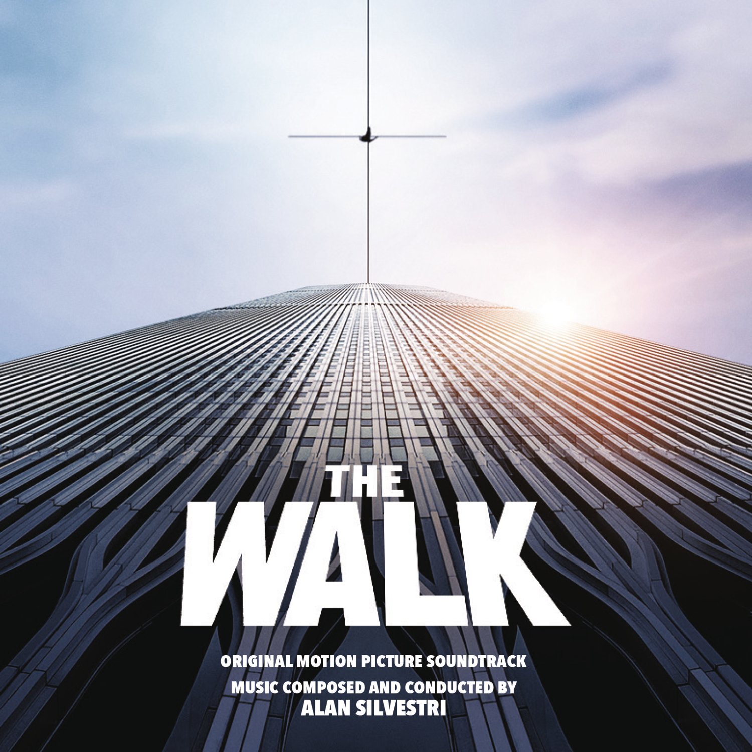
Next thing, the Philippe Petit character dancing on the rope. On top of a 110-story skyscraper he should be barely visible, but looks like fucking King Kong. I get artistic freedom and all, and that it’s not easy to promote the actual Walk in an image like this one, but blowing up the main character to ape-size is a bit of a cop-out. Also, why is the rope coming off from the middle of the rooftop, when it was in reality strained between the two corners of the twin towers? Last but not least, the chosen font type might be the most boring one they could come up with. And to cap it all, the text is even more pixelated than the rest of the image. Sigh… I tried to fix everything as best as possible (#1), but I still don’t really like this artwork. That’s why I came up with two alternatives.
My first custom cover (#2) features a much more effective image composition and is likely to give you some vertigo. I only added some semitransparent cloud PNGs to make the text more legable. The last one’s (#3) just a square version of the film’s teaser poster. I hope you like it.
