I am not really a James Bond fan. The movies do have my recognition for leaving a cultural mark on the film business and pop culture in general. But I’m not awaiting every new entry in eager anticipation. I also appreciate the modern twist that Daniel Craig brought into the franchise – which says it all basically. It was more because of Sam Mendes and especially Thomas Newman, that really got me enthusiastic in these films (and scores). But with the lukewarm reception of Spectre this short-lived collaboration may be approaching its end. And my James Bond custom covers series may as well.


")
The poster campaign once again looked more like something out of a fashion magazine. Sure, we’ve got a really clever teaser poster (#4), but beside that the focus was entirely on 007, which is becoming a little boring by now. At least Eon rediscovered their box of paints for a change (#3). And the teal background created a nice contrast with Bond’s ghostly-white Tuxedo outfit (#1). I initially created a similar custom cover, but canned it once the official artwork was revealed.
A thing I indeed liked about this campaign was the retro-esque Spectre font, which you can download for free on deviantArt. Despite its fancy typeface I’ve used it for additional album texts on some of my customs (#4, #7 to #8) and it surprisingly worked. I also dig the white skull mask which looks really badass (#2, #5). And Daniel Craig’s icyblue eyes in an otherwise completely monochromatic image (#5, #7) is another subtle highlight.
But unlike my modest Skyfall cover series this time I wanted to add some variety. So I turned to the fan community, which was way more creative and came up with some remarkable pieces.


The first one of the trio above (#8) is based on a fan poster created by deviantArt user “krallbaki“. I enlarged his poster to album art dimensions, added the 007 alias and some gold lettering. Quite lovely.
For the next one (#9) I’ve used a fanmade Skyfall poster and turned it into this precious looking front cover. I actually made this one in a more light/blue winter’esque colour tone, but changed it to the Spectre turquoise in the last minute – for the sake of unity.
Finally I’ve found this wonderfully old fashioned classic image on the MI6Community Forums (#10). There’s a fan art thread full of awesomness over there (seriously guys, check it out!) and this beauty by forum member “haserot” was literally begging for the Vinyl treatment. A James Bond Vinyl cover… also an unexpected first for me.
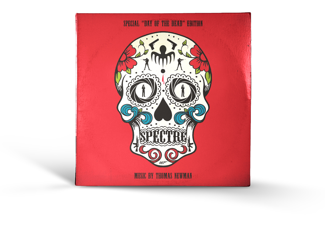
The “Day of the Dead” edition below is based on an amazing piece of work from Chris Wykes. I only switched his vintage Spectre octopus logo with the current one and added some album credits using the same font (“BlackHawk“). And it turned out great! Over the last thirty years the James Bond franchise has transformed into this slick and stylish infomercials (I may be exaggerating a bit). It’s a strange yet highly welcome thing to see the Spectre soundtrack packaged in this old-fashioned and lush, warm-coloured cardboard case. Click here for the front motive only.

Very nice work on the customs. Which font did you use for the “Composed By Thomas Newman” line?
LikeLike
You mean this one? http://sostopher.deviantart.com/art/SPECTRAL-Font-519861651
Or the official one? That would be Stainless Extended.
LikeLike
Stainless was the one I meant. I’m designing a Spectre cover for audio cassette but couldn’t find the font! Thanks
LikeLike