In retrospect, 2003 was a really strong film year. We got box office hits like Kill Bill, The Return of the King or Pirates of the Caribbean. But also allegedly smaller international films that were even better. 21 Grams by Mexican visionary Alejandro González Iñárritu for example. Or also two of the best Korean films ever: Jee-won Kim’s brilliant A Tale of Two Sisters and the original Oldboy by Park Chan-wook (which interestingly have both been remade into weaker Hollywood versions by now).
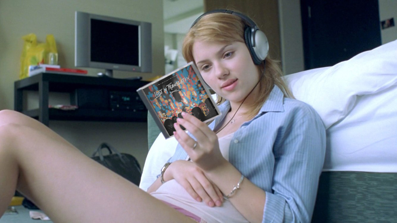
There was one film however that stood out from the crowd and that was Sofia Coppola’s Lost in Translation. It’s not only an absolutely timeless marvel, it also has one of the most tastefully compiled soundtrack albums I’ve ever listened to. So when my friend Sulley, who recently discovered this gem of a film, requested some custom covers for it, I immediately dropped all other works and gave it a go. Of course I’ve rewatched it during my preparations for this series, and I can safely say that it hasn’t lost any of its magic.

")
")


My first task was remaking all the official artworks (#1, #2, #3), since none of them were available as proper digital versions. And cover #3 turned out to be quite challenging to recreate, since this 2008 bootleg pressing initially featured a very blurry (albeit well worth seeing) photograph on the front sleeve. A lot of bad editing jobs were necessary on this one. But at least I got to use the official logo and also the original font type (“Geometric 231“), which allowed me to divert attention from the most obvious image artifacts.
The same design template was applied on several key artworks as well to gather a nice first round of custom covers (#4, #5, #6).


")
The real fun however was to come up with entirely new designs. Kinda like rebranding an already established trademark, which is always tricky to do, especially on generally acclaimed titles like this one. If you’d ask me I would suggest playing it safe by using official logo and type treatments instead of venturing out on thin ice. But every once in a while a film or soundtrack comes along that triggers a wave of inspiration among artists all over the place. And as a result a colourful bouquet of opportunities opens up, once you start looking for source material.
The first real custom (#7) absolutely was such an opportunity. It’s based on a gorgeous comic book illustration by Matt Taylor, one of my personal heroes. His painting for sure was one of the most beautiful source images available. But it got even better, when I found the perfect font to supplement it (“Againts“). I loved it so much, that I also used it on the last cover (#15), although with some alternate glyphs.
Other noteworthy typefaces within this entry are the extraordinary hand-made font “DEADman” (#2), which was also used on Ryan Gosling’s Lost River. Or the finely detailed “Akula” (#9) and the lovely calligraphy “Bombshell Pro” (#12) with its flowing letter connections. But I’ve not limited myself to hand-drawn fonts only. For example the two extraordinaires “Playtime” and “Paranoid“, both of which I’ve used on cover #10. Of course I had to include some Asian influences as well, namely in the form of the fonts “Soulmater” (#13), “Mitsuki” and “Ming Imperial” (both #14).
Despite all those wonderful typefaces there was one case in which I had to rely on a truly original font and that was Sofia Coppola’s genuine signature on the last custom cover (#15). This is not supposed to be one of my so-called Limited Signature Editions. But I assumed the director’s handwriting would be a charming addition to that beautiful hand-drawn painting. It’s an original artwork by Hungarian freelance artist Hanna-Dora and it was actually made with coffee (like, literally!). Go check out her Redbubble store. Naturally this imaginary Vinyl Edition is not for sale there, but she has a lot of other fabulous things on offer that make a visit worthwhile.


i love font number 10, what is that font
LikeLike
They’re called “Playtime” and “Paranoid“
LikeLike