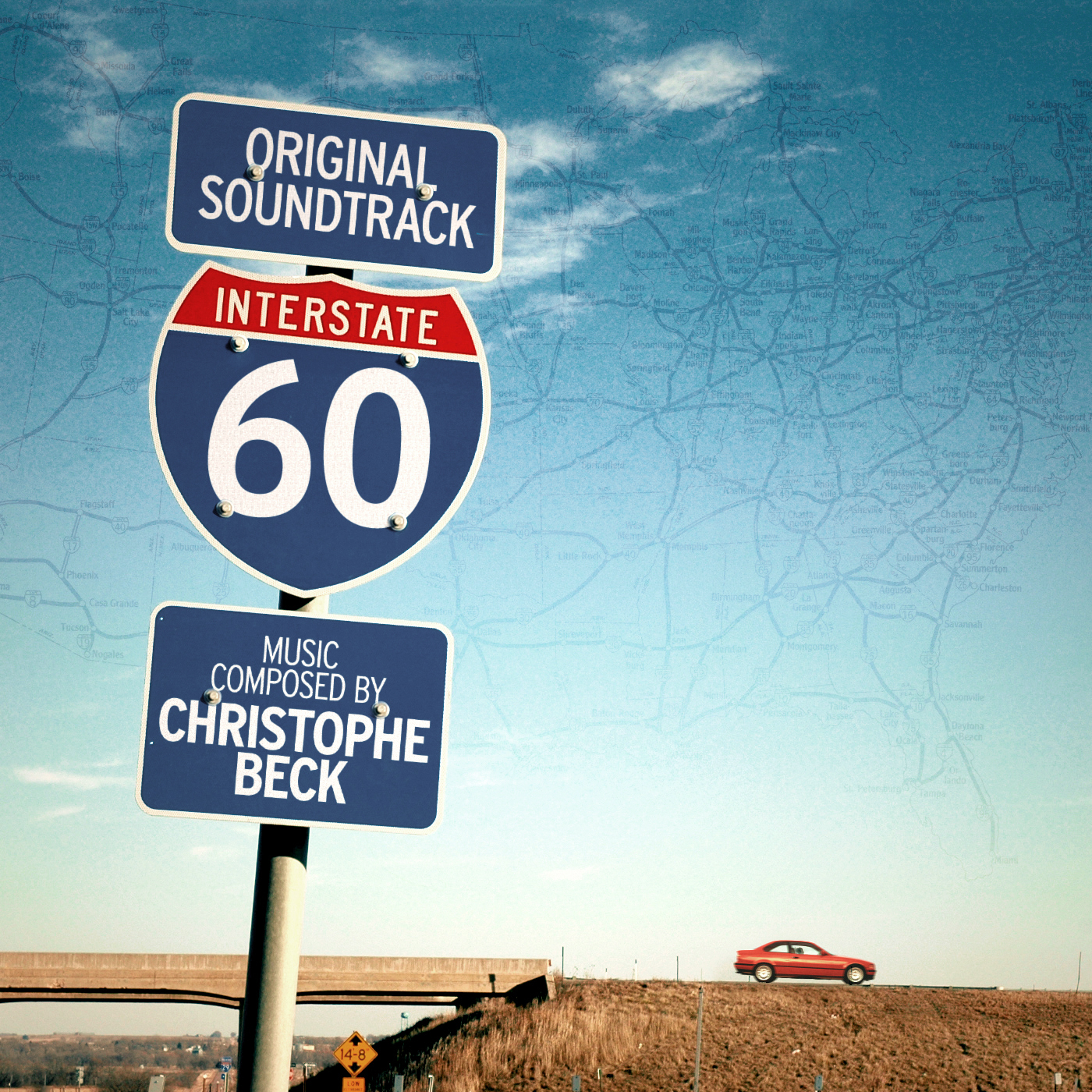
A small entry for an even smaller film I haven’t ever heard of before. But I was asked to knock out a design for an unofficial promo rip. And since the originally circulated promo artwork features every designer’s mortal sin under the sun, I felt compelled to right what’s wrong.
Without much of a saying, here’s an animated GIF of my work stages. I thought about adding this not only for educational purposes, but also to flesh out this poor, derogatory version of a blog post.
And to whoever shot the original photo used for this cover: Sorry for not crediting you personally. I hope you will find gratification in knowing that you’ve helped making the world of promotional movie scores a better place again.


Great work, excellent idea! I just can’t help myself and nitpick a little… Maybe it’s a perspective thing, but the custom font on the signs seems a tad off. Just a tad.
LikeLike
I never heard of this movie before but wow! Directed by Bob Gale, writer of BTTF? With Michael J. Fox and Christopher Lloyd? Plus Gary Oldman, Kurt Russel and Chris Cooper? Damn, I’m definitely adding it to my “to-watch” list!
That being said, the original artwork indeed looks awful. It is so wrong. On so many levels.
Your cover, on the contrary, looks fantastic! Especially considering the promo artwork and the image you used as a source… I think it’s fantastic. I also love how you integrated the text. Fantastic ideas!
LikeLike