Oscar Season! It’s that time of the year again. When Hollywood is collectively blowing its own horn. But because all critics are busy watching the screeners that filesharers are so grateful to share with us all, any film released during January and February automatically falls into that awardless oblivion. And so Oscar chances for all other professions associated with the film are ruined as well. Much to Michael Giacchino’s demise Jupiter Ascending is one of those films. One that the Academy of Motion Picture Arts and Sciences will pretend not to exist by the end of the year (just like they did with Maleficent last year). And what a pity it is, because Giacchino’s score is downright phenomenal!


I’ve decided to open up this custom cover series with the original artwork. Jupiter Ascending‘s official album art (#1) is quite atmospheric and slightly asymmetrical, which makes it easy on the eye – cause we surely know that the unbalance of a picture is what attracts us. Although I’m still not sure what the two main characters are doing there, standing all giantly in the middle of this spaceport. And what the hell is Channing Tatum staring at?
At least on this point my first custom cover (#2) is varying a little bit. Now he’s throwing Blue Steel at us, the audience. I’ve by the way used up my lens flares budget for this one so don’t expect anymore in the near future.


The artworks above are what I consider Photoshop porn. Just have a closer look at those faces (especially #3!), they’re as far from realism as this website is from famousness. They’re the very antithesis of handmade art. But they bring asses into seats and that’s what they’re supposed to do. On a side note, I had to slightly stretch Sean Bean’s image, because the studio narrowed it down a bit too much. Maybe he was just too fat for the part? Too fat and too old for today’s target audiences. But his character is going to die off anyway.


To make up for the overkill of human beings on artworks, here are two landscape motifs. And boy, that first one was a lot of work! I wanted this kind of cover art so badly, that – in my juvenile impatience – I patched together a rather bland early first version. I was so unsatisfied by it, that I pulled myself toegether and started all over again. This time I combined three different images (the official poster, a high res Jupiter pic and a generic space background) and repainted a whole lot of it myself. Now it looks like a genuine Jupiter Ascending artwork, although it’s completely custom made. And to make it look even more genuine, I’ve used a custom created font called “Jupiter Serif JC“. Its creator, Juan Casco, was so generous to share it with me at a discount.
I kinda like the next one (#9) as well, the only thing I have a spot of bother with is the city skyline at the bottom. I don’t know about you, but that skyline reminds me of one of those 80’s romantic comedies. The only thing missing are two floating heads (see #13) and a cheesy tagline. Something along the lines of “Nothing on Earth Could Come Between Them” or “Jupiter’s on Collision Course… With Love!“. I guess the city’s just a little bit too genereric. I’m missing a bit futurism here, but maybe it makes sense after watching the film?
")


In addition to the official poster campaign design companies Art Machine and Little Giant Studios created a collection of alternate posters. Some of which I’ve borrowed for the gallery above.
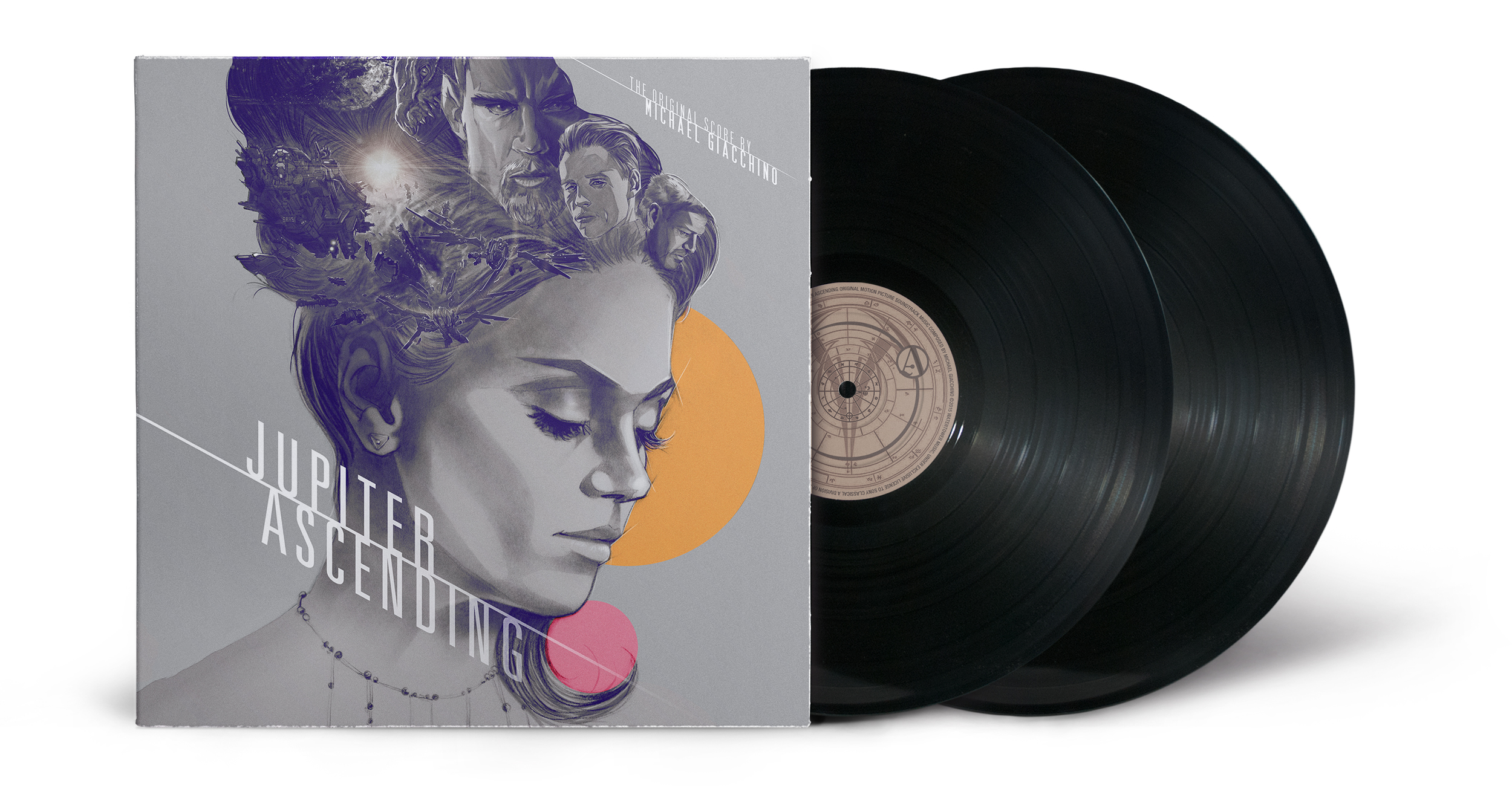
I figured I’d make a Two-Disc Vinyl Edition (#10) since the original score came on two compact discs as well. I horizontally expanded this really pretty source image to preserve as much as possible from the original within the square canvas. Oh, and being the sole princess of the univers can press on somebody’s shoulders, isn’t it?
After that we’re coming to the generic action flick artwork (#11). I’ve especially created a custom style logo treatment, all flamery and stuff. Lots of action in this one, isn’t it? I had to tone down the colours on this one, because the cover kept screaming at me constantly everytime I worked on it.
Another action piece comes in the form of custom cover #12, only this time mimicking your typical IMAX Special Edition poster art. I love how the two characters are in full action mode shooting polyurethane foam out of their spray guns. And do I see a hint of a smile in Jupiter Jones’ eyes. Enjoying it a little bit too much, aren’t we? Maybe that’s not the IMAX, but the Do-It-Yourselfers Edition? But let’s not be kidding, I indeed love that design. I’m up for that comic style any day!
And so after all this gun-fighting kick-ass action it’s time for some togetherness. The classic retro painting of cover #13 screams 80’s all over it. And at first I actually planned to recreate this one in perfect style of The Empire Strikes Back, Highlander or Masters of the Universe. One of those typical sci-fi flicks from the old days. But this was actually the last custom I’ve made and I simply ran out of time (and steam). The same could be said about #14 and #15 as well. Only that these were the first ones I’ve created and I didn’t know yet where this custom cover series would take me thematically and stylistically. So they’re just there, without serving any special purpose.
")
")
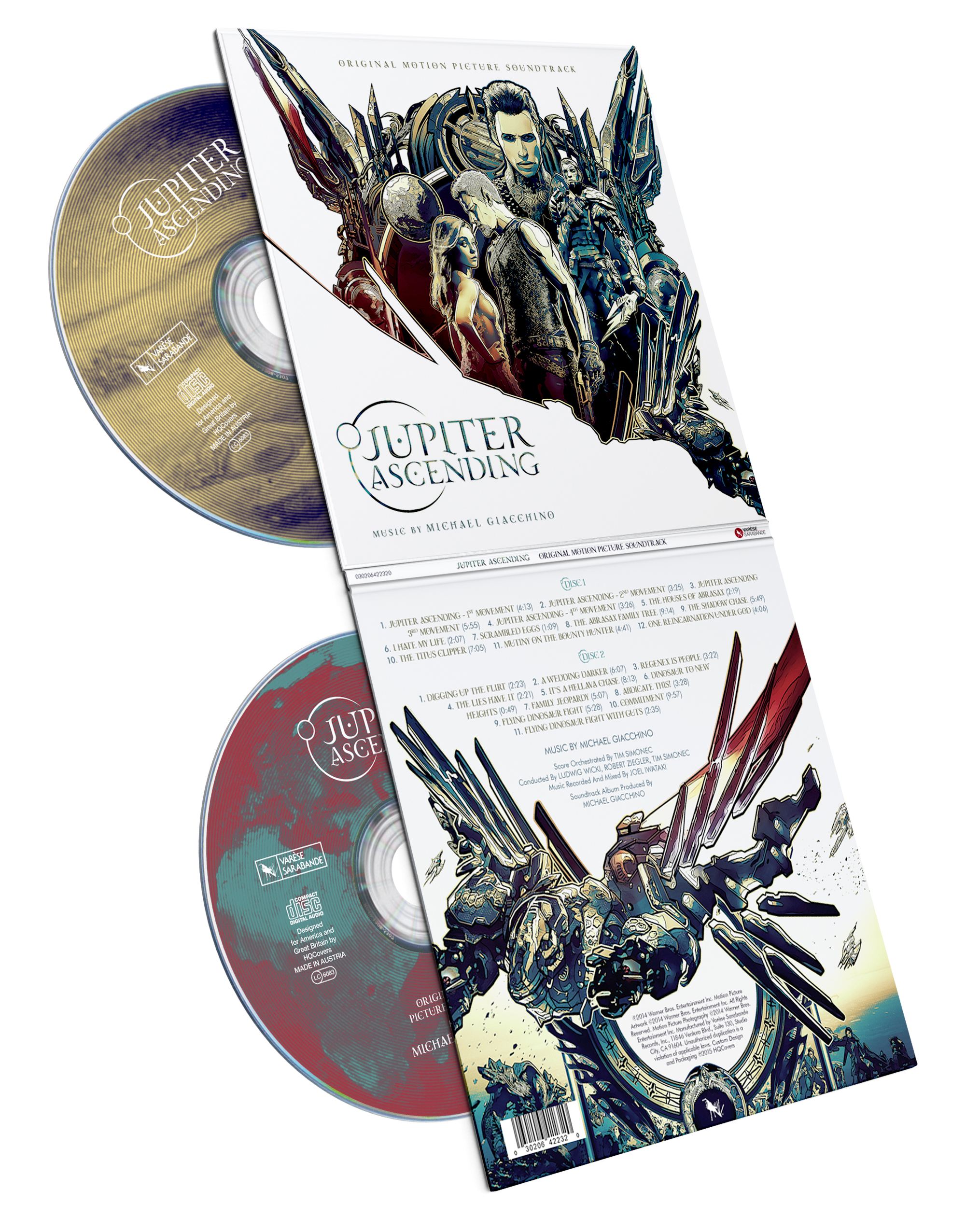
The last cover (#16) probably took the most of my time, of which a fair amount was needed to find a good, upright 3D mockup. I dissected the alternate poster into two parts and then used the resultant white space in between for all my text gibberish. This one is thought to be for the autographed Special Edition by Varѐse Sarabande, which unfortunately only comes to the US market. And it’s apparently out of stock already. Better luck next time.

I love the original, but #3 is perhaps my favourite. Also, what the hell is up with Channing Tatum’s arm in #4? I don’t think it’s your fault, because it looks weird in #1 as well, but geez; it looks terrible! #14 is another exceptional one, which I wouldn’t mind actually using.
Great palette man!
LikeLike
[…] in form of a golden metal texture and the remaining stock of lens flares which was still left from Jupiter Ascending. And once again my affinity for circular shapes on square album covers comes to light. […]
LikeLike
[…] is creating eyesore galore. This is butt ugly Photoshop porn. But the cheap one, not the premium shit. Seriously, do they want to sell jewellery at Dolce and Gabbana, or an epic action adventure […]
LikeLike
[…] one (#7) is based on unofficial artwork as well. In fact I used one of heidl’s designs for Jupiter Ascending as a background, extending it with my trusted starfield and replacing Jupiter with Mars (employing […]
LikeLike