The John Williams of the new century is a notably different affair than the one we’ve come to love and admire during the 70’s and 80’s. His musical palette was enriched by a darker and more mature sound, often times omitting the hummable themes he’s become famous for. Maybe it’s especially that new quality, that required (and ultimately rewarded) repeated listenings, that turned War of the Worlds into one of my favourite John Williams scores.


")


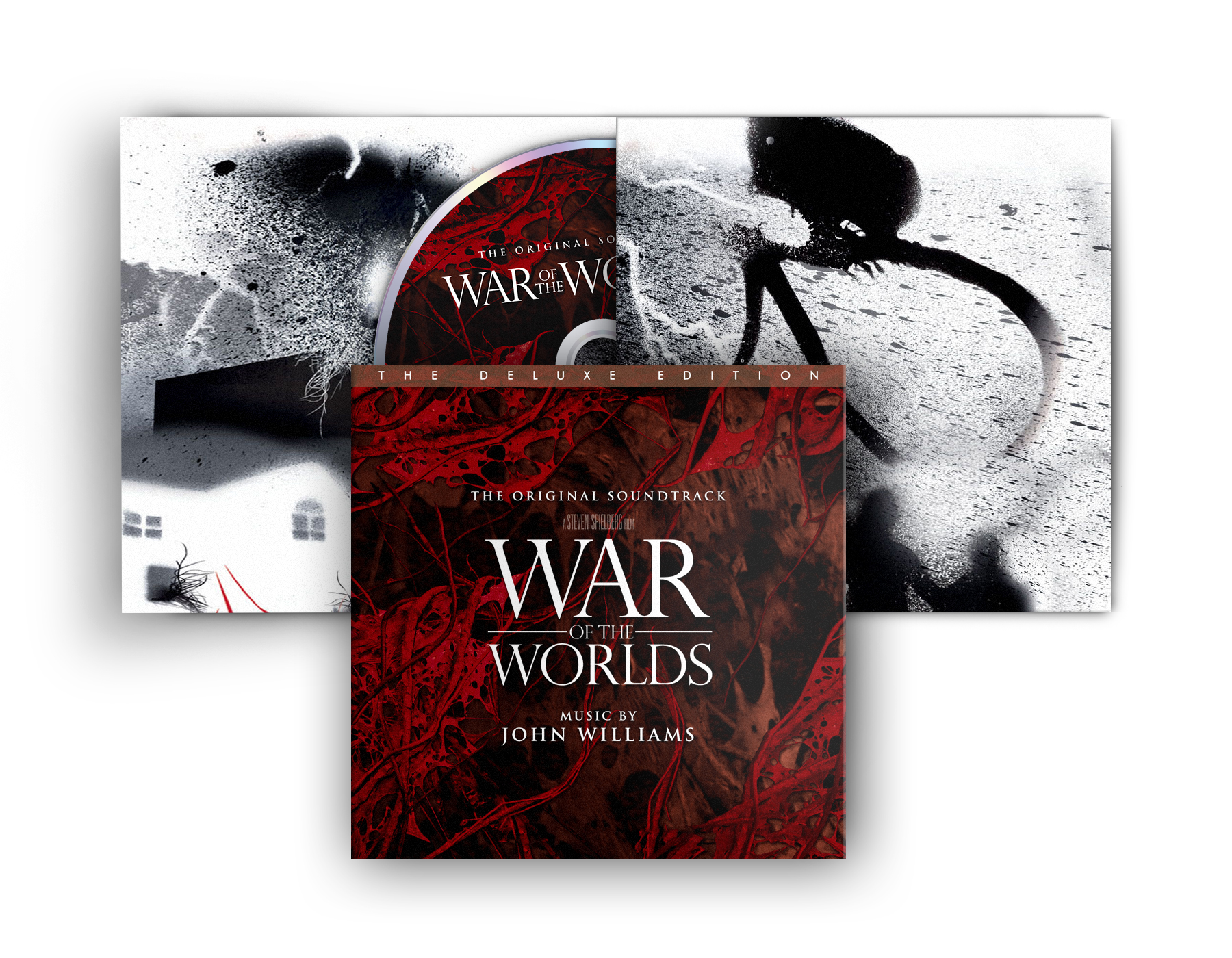
Much to my delight I was able to incorporate all official logo treatments into this custom cover series (#1 to #4), even though the perspective is slightly off on the last one (#4). But overall it works. Visually they’re all very spectacular, its designer Thom Schillinger did a fantastic job in bringing out the magnitude and impact of the films scope. Yet my personal favourite would be #3 with its traditional and timeless typeface (“Perpetua Titling MT Light“).
The Deluxe Edition (#5) isn’t that deluxe after all. Following the recent trend of wrapping old material in a new coat, this 4-panel disc wallet cover doesn’t bring anything new to the table. It doesn’t even feature a booklet (I can already hear the outcry). What it does feature however, is a lovely handdrawn panoramic view on the inside and a plastic-free packaging for the environmentally friendly film music fan. Make love, not war!
My first retro cover (#6) is based on one of the numerous book covers available. I chose the Signet Classics Edition from 1986, including a few modifications. First I changed the image format to square, naturally and then I replaced the somewhat clunky tripods with the 2005 versions from the Spielberg film. The font is the wonderfully retro “Greko Deco” by Dave Fabik.
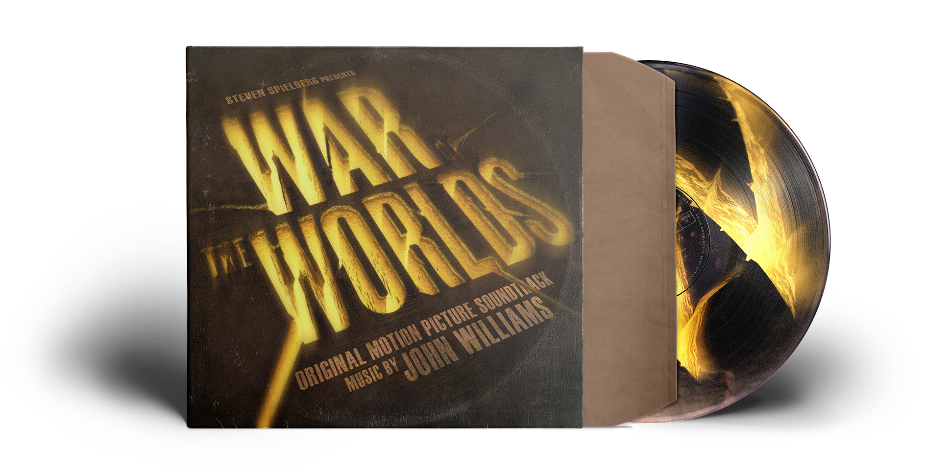
With the last one (#7) I’m replicating the design of Jeff Wayne’s musical version of The War of the Worlds. And again the whole cover was cooked up using the most various sources. For the background image I meticulously extended an official wallpaper in width. Only to find the wider – and way more useful – concept art it was based on after I was done. Well, shit happens! But I’m very pleased with the outcome of the embossed title logo. It’s a conglomeration of layers, styles and effects applied to the official logo of the 2012 version of Jeff Wayne’s musical.
In conclusion I want to show you something I initially didn’t plan to include in this post.
Below you find the failed attempt of combining some of Thom Schillinger’s custom logos in one custom vinyl mockup. I’ve only added this one to showcase that not every idea is worth following. Sometimes it’s better to save your time or invest it in something else, something more meaningful. Like staying up all night messing up your websites well-established and fool-proof design. Yeah… definitely a better idea.

“J.WILLIAMS”. LOVE the play on the vintage book cover title!
LikeLike
I know right? Sometimes it’s those simple ideas that make a whole lot difference. Sometimes they just pop up in my head, and I hope they’ll continue so.
LikeLike