A secret world, future technology, a faceless enemy and a mysterious little pin… these are the ingrediences of Brad Bird’s latest tale of wonders.
I’m really looking forward to Tomorrowland, both the movie and the score. But while the titular place has a BioShock Infinite like retro-futuristic vibe, the marketing campaign was severely underwhelming so far. This film holds so much promise, but for an entirely new intellectual property Disney imho failed to create something remarkeble. I dig the pin design to some degree, but I think even this MacGuffin-like prop could look a little more magical. The director himself designed a really wonderful logo (which I kind of used in #5), but Disney watered it down once again and went for a more blander style by using the already overused “Gotham“.


")
")
My first custom (#1) was mainly inspired by Giacchino’s/Bird’s own Ratatouille and its barebone artwork. I think especially for a new movie (-franchise?) like this film, it’s important to establish a memorable trademark. Something the common folk will remember. Jurassic Park is a prime example in this regards. So custom cover #1 was my attempt at making it as iconic as possible.
Of course it’s also inevitable to emphasize the art design on at least a couple artworks (#2, #3), especially for a visually rich film like Tomorrowland. Although I designed #2 before the official cover was revealed, Disney beat me to it and created just the same cover artwork. But for whatever reason, they managed to enhance it for the worse. It’s beyond me, how an official artwork with such contrast levels could get approved. Brightness is completely off and a lot of details in the bottom area are gone. But it only undermines Disney’s lackluster approach for this film and score once again.
Custom #4 is actually based on a real set photo taken by Kimberley French. It was taken at such a perfect angle, that I could easily add the original movie title and give it a go. It’s interesting to see that the actual pin in the film looks different that the one on the promotional stuff.
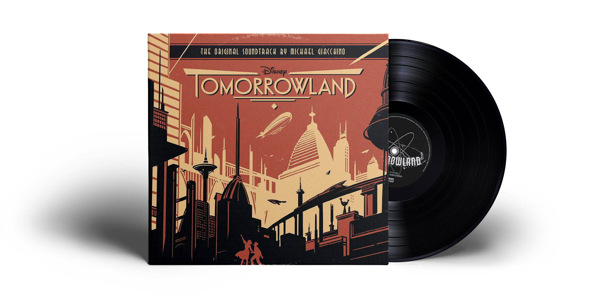
The Deluxe Edition (#5) went through a couple of stages and I’m still not really happy with it. The wording on top was directly taken from Disney’s Legacy Collection. And a little trivia for you: The bottom area was brightened up by overlaying the early first movie logo.
The final entry (#6) – once again a Vinyl artwork – is based on the official Before Tomorrowland comic book by Jeff Jensen and Jonathan Case. I love the retro touch and the isometric perspective. This art deco style is what the movie really needs to have and I hope Brad Bird an Co. pulled it off.