Ever since Brick I’m a Rian Johnson fan. I was delighted to see him being catapulted into Hollywood’s writer/director A-list with the success of his Sci-Fi-Brainer Looper. I think the film is a classic grower, that gets better and better with every viewing. Oddly enough, as often as I have seen it already, I’ve never really noticed Nathan Johnson’s score for it. And I still can’t recall any piece of music from the film to this date (unlike Brick which I love listening to). To be honest, my main motivation for doing this series, was the original cover artwork (#1) which looks really fantastic! I love soundtracks that feature entirely different album art than any of the official film posters. it somehow makes the soundtrack more valuable, like a separate product of its own.


")
")

My first custom cover (#2) is a variation of the US quad poster. I love this mysterious and intriguing image, the lighting is fantastic! It’s a perfect blending of realism and phantasy. I’m not crazy about the font choice (“Gotham“), but I can see why they went for simplicity on this one. The next custom (#3) isn’t that fancy either. Compared with the first two covers and their narrow-packed vibe, this one emphasizes a broader and more open-spaced layout. I designed it to suite the La La Land Limited Edition from 2012, using Varèse Sarabande’s Deluxe Edition banner for it.
Cover #4 is one of those rare cases when everything just falls into place by itself. I was working with this awesome poster design by UK designer Christian Ward and was thinking about incorporating the album credits without destroying the overall clock face layout. In retrospect, it was only logical to use the second indicators for it. And as chance would have it, it worked just perfectly! I left out every dial that was covered by any graphical element and replaced the remaining ones with ultra condensed letters from the font “SF Movie Poster“. The customized Mondo logo on top should help offset the image vertically. The horizontally unbalanced film title doesn’t bother me at all, I absolutely love this custom cover as it is.
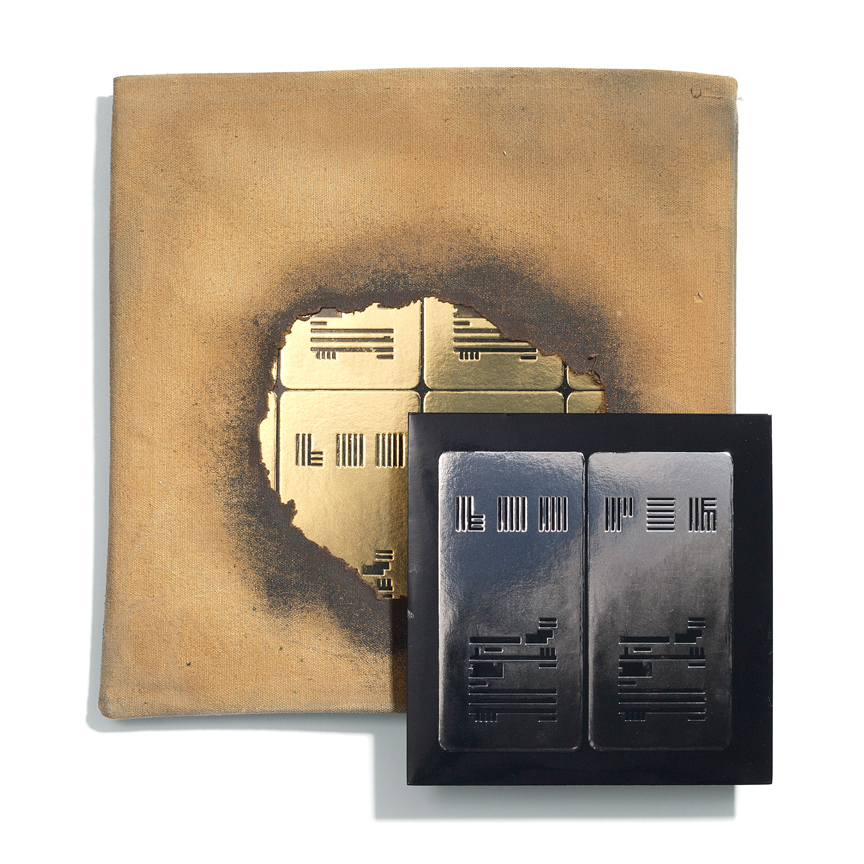
Another reason for me to post this custom cover series, was this year’s Limited Edition from Mondo. The double Vinyl came in a really unique package designed by Jay Shaw. Be sure to check out this link for the full story behind this creative gem.
")
")

#5 for me. Yeah, as usual its the retro designs that get me. Its a bold design and I love the typography (that title logo just screams 1970s at me). I can imagine that cover art looking great full-size as a 12″ vinyl. Maybe less so as a CD, but that’s usual. We’ve lost so much with album covers since everything had to work shrunken to CD size. I remember all those great 1960s and 1970s albums being re-released on CD as the format took hold, and how so many great album covers looked utterly naff reduced to CD size. Its like the whole design fails to work on the most basic level, its weird, as the original as a 12″ album cover might be so perfect.
LikeLike
I guess it’s a combination of the font choice (AvantGarde – a real retro classic!), the colours and also guys’ clothing :)
If I had endless time I would provide every soundtrack release with a proper Vinyl jacket. I love doing them!
LikeLike