Why would anyone want to do covers for an apparently nonexistant soundtrack album? Well…
First and foremost, because Alien Isolation is just one fucking awesome video game! I don’t play far as much as I used to, but Isolation is so immersive, it managed to keep me glued to the screen until four o’clock in the morning. It’s that gripping and tense! No matter what, the graphics, the sound design or the overall programming, it’s brilliant in every aspect.
Another reason may be that there is indeed an inofficial bootleg album floating out there… and thus there may very well be demand for some artwork – at least among us hard-core fans. So I eagerly sat down and came up with the bunch of designs below. And to keep it at least a little relevant to the game’s release date, I decided to throw it in right in the middle of my Alien custom covers collection.


Creative Assembly ran an employment ad prior to the development of the game and I always liked the simplicity of it, so I took it as a starting point for my main cover (#1). Despite having found the advertisement in a fairly decent resolution, I recreated the whole thing using different elements. The Alien egg in the middle was indeed taken from the original 1979 score by Jerry Goldsmith. The placement of the album credits and everything (except for the logo) is also a direct reference to that score. I literally copied the text layers from one Photoshop file to the other. To achieve that worn and used optics I made extensive use of my Machine Wash Deluxe filters on this one, something I’ve been a bit lazy with lately.
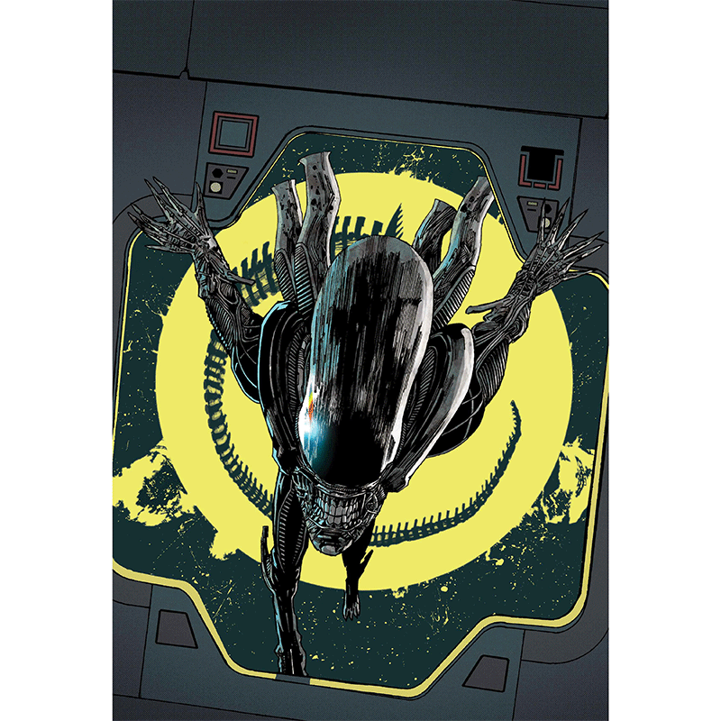
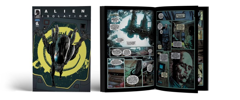
Cover #2 was among the last additions and quite a lot of work to be honest. I was searching for one final template to round out this series and Henry Flint‘s front cover for the free Alien Isolation comic book (which I’ve attached at the end of this post) was perfect for that matter. There was just one problem: His image was in extreme portrait format and every attempt to crop out a square picture came to nothing. So I swallowed the bitter pill and expaned the whole image by myself. To get an idea about how this is done, please have a look at the animated GIF to the left.
A stylistically similar image was used for the next cover (#3). Creative Assembly added two new difficulty modes to the game via patch and also released a set of retro sci-fi posters to go with it. A welcome opportunity for more Vinyl goodness.
Besides all these customizations I also had to make a few semi-official versions (#4 to #6). After all there were a lot of really high-quality wallpapers and key artworks to choose from. What a waste of chance not to use them… the only challenge here was to find appropriate and fitting font types. But I always struggle with allegedly simple tasks like these, so it took me a fair amount of time. Additionally, on cover #6, I had to move Amanda Ripley down a bit to make room for the Alien Isolation logo, hence the Alien in the background appears much larger than it is in (the game’s) reality. Almost like a giant, beefy lion – and a pretty frightening one as well!
Custom cover #7 references the antiquated VHS look Creative Assembly utilized so greatly within the game. At one point I was thinking about creating the whole cover in the same 70’s bicoloured computer screen style they used on all of Sevastopol‘s terminals. But I also like it the way it is now.
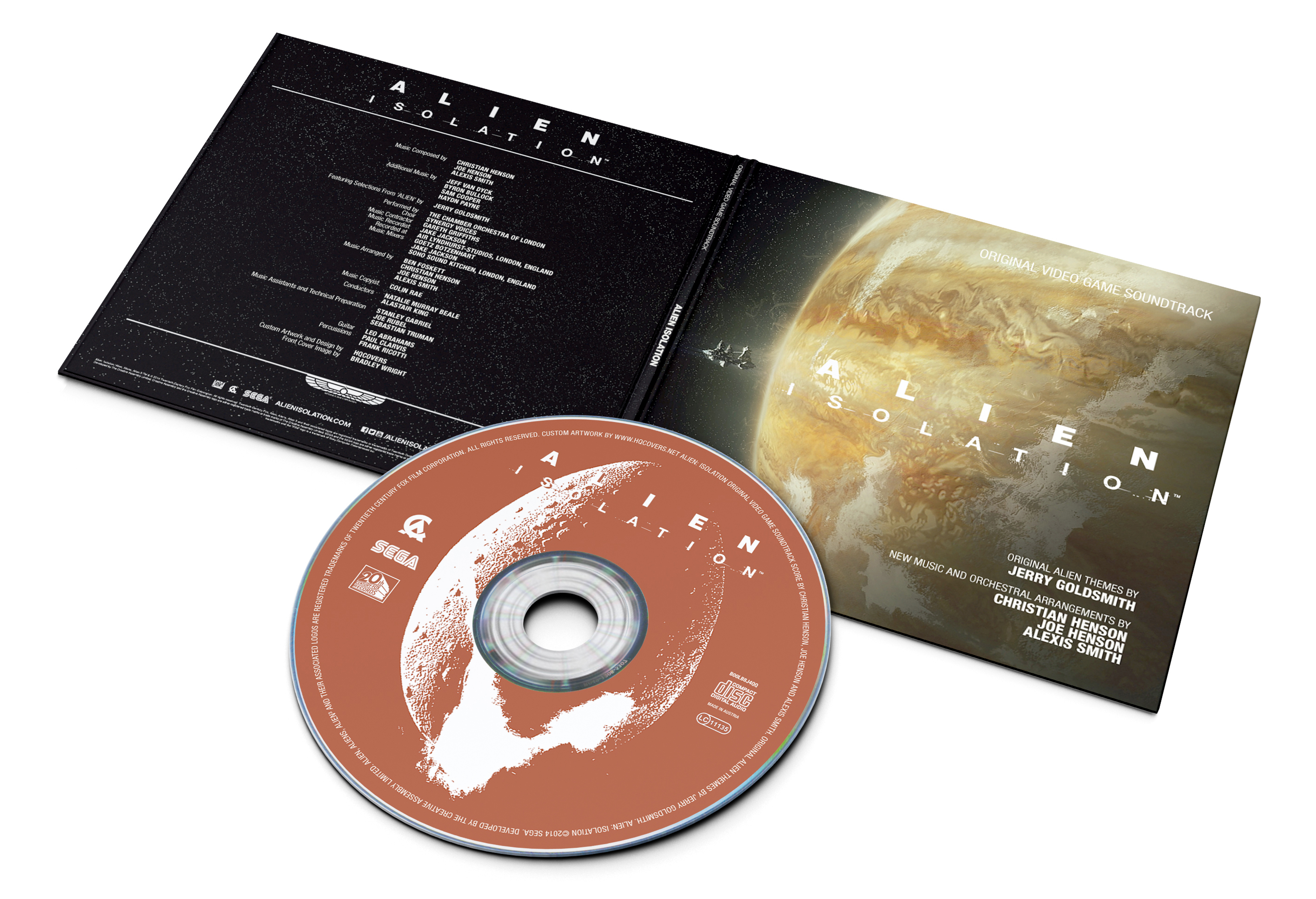
For the next one – and because by now no post would be complete without one – I’ve again created a full front and back cover sleeve, this time for an imaginary CD release of the score (#8). A concept art by UK artist Bradley Wright served as the perfect template for this widescreen artwork. Missing an official tracklist, my only idea was to add a listing of the music crew on the back cover and I think it works fairly well.
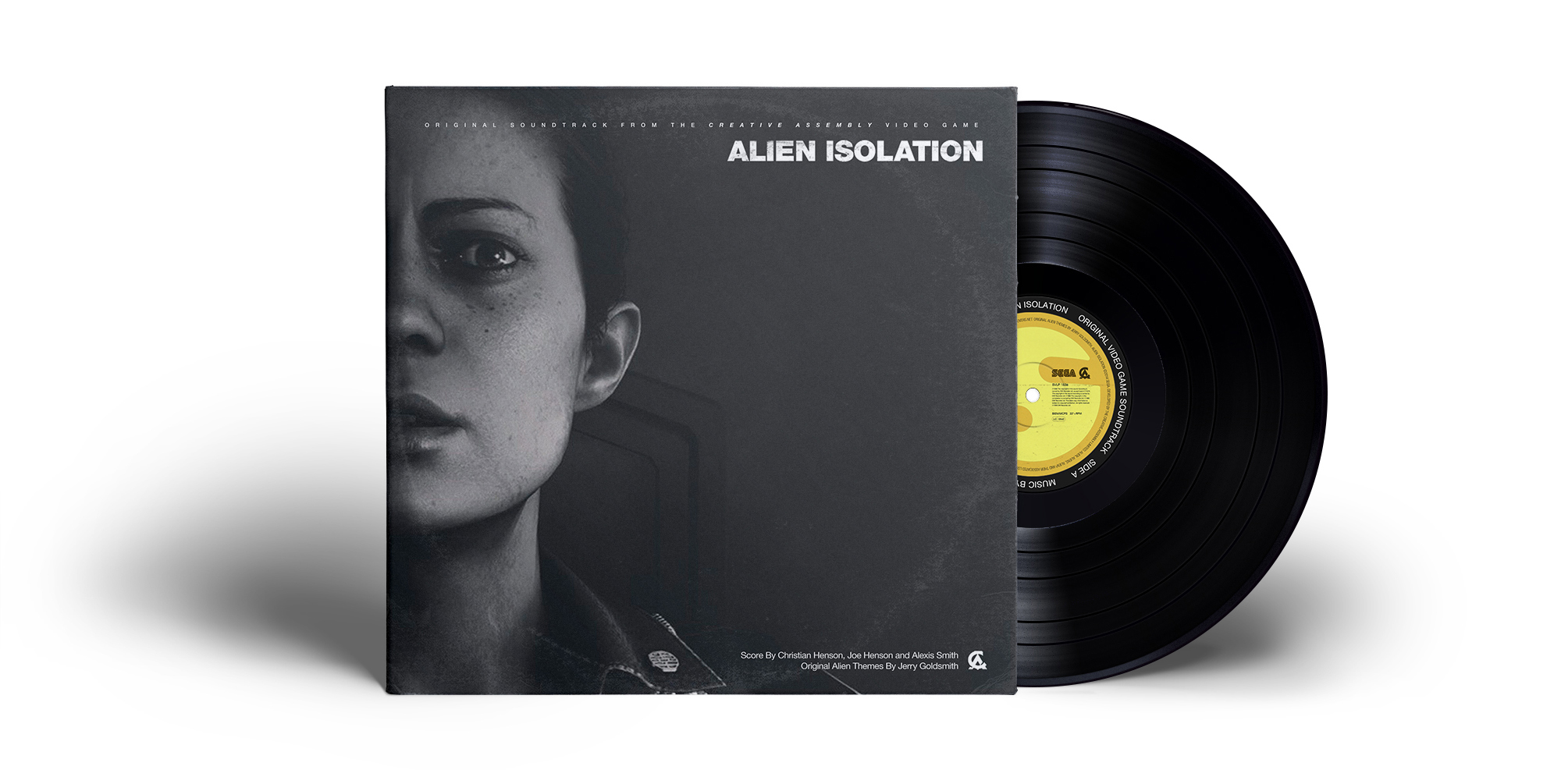
A late addition to this series is my Vinyl Edition (#9) which is based on an actual game screenshot I’ve found on VirtualCrunch. I did this one pretty quickly, using already finished text elements taken from an earlier rejected draft of cover #1. It worked perfectly on this template! Another reason I wanted to create this one was the record disc label. The original Seegson logo perfectly fits the round shape of the disc and I almost regret that I haven’t thought of this earlier for the previous mockup (#8). But then again, I would have had no reason to continue working on this series.