Early January I registered myself on the John Williams Fan Network and it wasn’t long until a very nice bloke named Karim Elmahmoudi messaged me and asked if I’d be interested in designing an original cover for him. He’s a musician, orchestrator and of course classical composer from Los Angeles and has worked on such prestigious projects as Spider-Man 3, Star Wars: The Old Republic or the recently released Grim Fandango remake. His work ORBIT: A Symphonic Fantasy is being played at the California Science Center (permanent home of the Space Shuttle Endeavour) as the theme music of their IMAX productions.
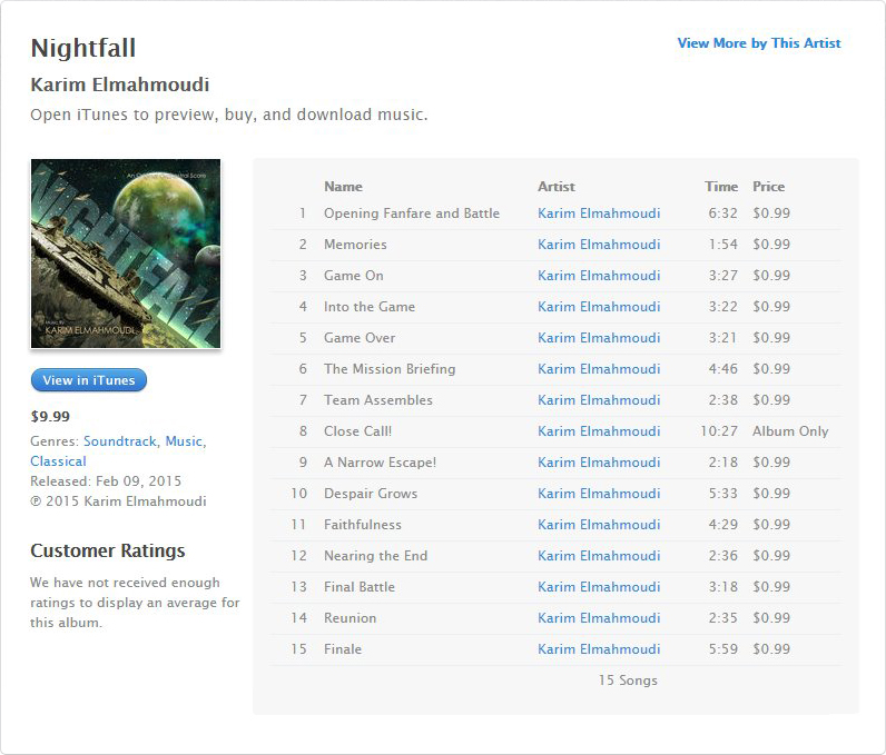
So when he approached me to create an original artwork for his sci-fi action adventure fantasy demo CD, eventually entitled Nightfall, I more than happily accepted. Nightfall is an epic space opera/science fiction score in the style of Star Wars and other space epics and finally arrived as a 65 minutes album on digital distributors worldwide (iTunes, Amazon, CD Baby).
I worked on this project over the course of ten days and it was a highly interesting experience! Although I did this for free (let’s just say I’d like to avoid any fiscal entanglements), I suddenly felt the pressure to deliver something specific, something I was asked to deliver. Even though Karim was totally cooperative and encouraged me to do whatever I felt like. But I for myself placed the burden on me to come up with something great. Something that would please me as much as him.
Karim pretty much gave me free hand and only told me to do a “generic epic space opera scene” together with some possible titles (Nightfall, Polaris, The Colour Out of Space). But without any related source material whatsoever, this quickly became rather difficult.
On a project like this you can only use stock images and the spectrum of available space images/illustrations is pretty limited. Not to mention cinematic or actually good-looking ones. And browsing through hundreds and hundreds of unimaginative stock images is really exhausting as well. So I let myself be inspired by his words and music and tried to visualize the finished artwork without the conceptual artistic corsett in mind. After a few days I was finally able to offer him eight early and very different drafts.
Nightfall
The title that ultimately made the cut and the one which probably best reflects the action-oriented style of Karim’s wonderful music.


For the official artwork (#1) I used an image which probably comes closest to Karim’s preferred epic space battle stuff. The tilted perspective furthermore evokes memories to his first release ORBIT: A Symphonic Fantasy. The most demanding job on this one, was to make the overlayed text appear as if it was in the background. I had to cut out all those little antennas and spaceships by hand, which was incredibly demanding!
The stock images for the other two customs came close to the desired scifi/action genre, strictly speaking Star Wars (#2) and War of the Worlds (#3). Maybe the latter one wasn’t exactly our field of target, but the title Nightfall fitted this particular image very well.
Colours Out of Space
What a wonderful opportunity to use that awesome space planets source image (#4). Although I have to admit that it doesn’t necessarily evoke the sense of an epic action adventure. It looks more like a TV doc. For custom #5 I assumed that the “Colours” were alien creatures out of space, invading earth and terrorizing everybody with a dreadful colour palette.
Hey, I was brainstorming and it was worth a try.


Well… maybe not.
Polaris
This might be the most original (but ultimately inappropriate) title. It was for sure my preferred choice, but my imagination got carried away with it. I couldn’t come up with a single space related artwork for this one. Polaris for me was shaped out of surreal land- and psychedelic dreamscapes. I understand this wasn’t particularly what the client requested, but as I said before, source material was sparse. The last one (#7) even was named “Star Wars” and features an iconic Vaderesque head shape. But all in all it didn’t work out.


All in all this was an absolutely exciting and totally new experience for me, and for this I’d like to thank Karim for walking up to me.
Seeing my finished cover art on the iTunes store is still beyond words! Even more so considering that I do this stuff on a regular basis for just two years now. I tasted a glimpse of the real graphic design business and although I felt like a bloody rookie, I would highly welcome any other opportunity without missing a beat.
One last thing about the alternate versions here on this blog:
When you work with royalty stock images there’s a good chance somebody on the web has already used them before you. Therefore cross-searching with Google pictures delivered some decent results and I was able to rebuild my desired images out of fragments from various sources. This way I could create higher quality versions of my earlier rejected drafts which were only based on Shutterstocks composition previews. I guess I’m allowed to do this, because they’re not part of the commercial thing Karim and I have been working on and I didn’t want to buy each and every one of them just to show off some alternate versions. Thank you.

[…] Armies. And I’ve also designed my first truly original artwork for Karim Elmahmoudi’s Nightfall. But these are just a few cornerstones of the overall progress of the site. All in all it’s […]
LikeLike
[…] work for composer Karim Elmahmoudi. After a truly great experience on our first collaboration Nightfall, I was pleased to see him come back to me a few months later for his latest orchestral work called […]
LikeLike
[…] on that is available publicly. My first venture into the big business was Karim Elmahmoudi’s Nightfall back in 2015. I’ve come a long way since then, but it feels just as exciting to know that a […]
LikeLike