My clean-cut plan to raise visitor stats from last week’s blog post seemed to work. All facts at hand are providing a strong suspicion that at least one of my two additional visitors was redirected here through those cleverly placed hashtags. To calm the crowd I immediately follow up this week with a not-so-popular soundtrack. In fact, I’m pretty sure that the bulk of film music fans couldn’t care less about an electronic score like Ex Machina. But I do. In my book it’s an absolute benchmark when it comes to audio post-production.
Alex Garland’s directorial debut is an amazing, downright incredible visual experience, but combined with the musical score from Ben Salisbury and Geoff Barrow it builds up a tension one can hardly escape. It sucks you right in and is full of subliminal layers of pulsating, brooding and unnerving sounds to create a real Freudian nightmare of a film.
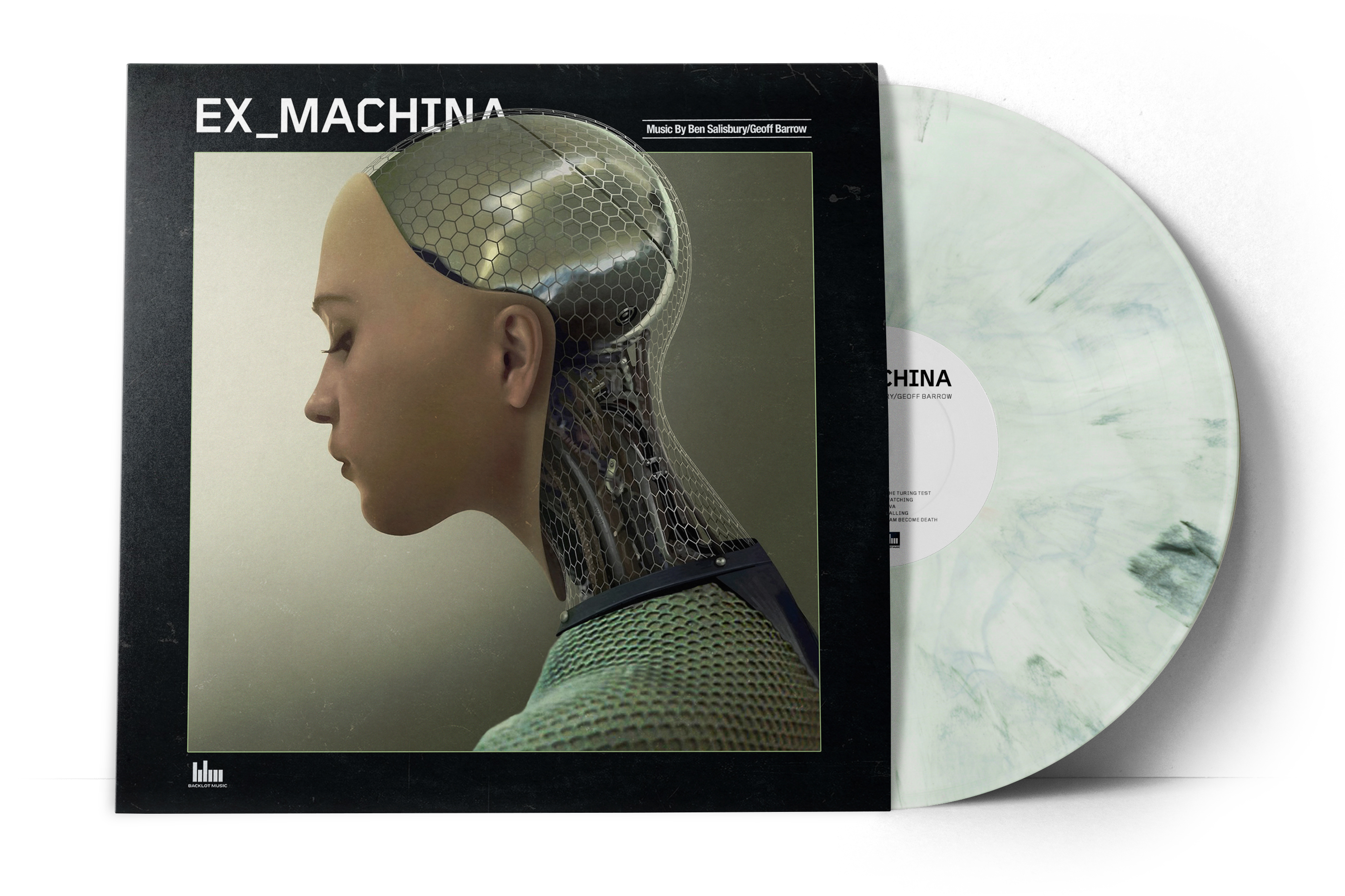
But it wasn’t solely the soundtrack that finally convinced me to turn Ex Machina into a full-blown custom covers series. I had already made one custom cover about a year ago, yet with a wrong typeface. When I recently got hold of the original fonts that were used on the official promo material (“Foundry Gridnik” and “Lab Sans Pro”), I used this opportunity to update my cover (#6) and come up with several others as well.
ORIGINAL LOGO DESIGN
The first leg of this post starts with a handful of covers using the original logo badge from the official posters.


Nothing spectacular here, although I spent a fair amount of time recreating the background grid on cover #3. Oh and I might add, if you’re a tech-savvy person and like machines and stuff, make sure to have an extended look on that beautifully crafted bum on cover #1. The level of workmanship is one of a kind.
ALTERNATE LOGO DESIGN
The official soundtrack artwork (#5) – and also some early posters – featured a different logo treatment using the more angular font “Foundry Gridnik”. This monospace typeface is a bit stronger and slightly more technological in its approach, thus making the crimson badge beneath the movie logo unnecessary (#3 is claiming the opposite… I know).


TITLE LOGO DESIGN
A third typeface has been utilized within the film. And this time, in a very special and creative way.

")
Let me reference Fonts In Use once again:
The main titles during both the opening and closing of the movie Ex Machina are an unorthodox use of the layered typeface “Idler“, which is a typeface that consists of layered styles. Instead of using the typeface in the conventional way (stacking layers of the different styles to achieve a 3D, multi-colored beveled look), designer Matt Curtis instead just used the weight Idler Inner. This “Inner” style is actually just the isolated inline of the beveled letters, but when used on its own it has a sort of mechanical, rigid futuristic look.
For this pair of covers I’ve used two contrasting source images. First a brightened variation (#8) of the Mondo x SteelBook #010, with original art created by Jock. This British artist was also directly involved in the making of the film, designing a great deal of concept art for it (see covers #16 and #17).
The dark counterpart on the right (#9) has been accomplished by taking a bunch of screenshots from the mesmerizing end credits, which then were rotated and superimposed over each other to get a square image. I also painted in quite a lot of lines myself, mainly in the corners to cover up some dirty transitions. Unfortunately I haven’t been able to find any additional info on this title design, it would have been really interesting to hear some thoughts behind it. I assume Fugitive Studios UK must be responsible for it, since they were also the ones to come up with that title font. But there’s no mention on their website, so this is not verified.
STUDIO ALBUM DESIGN
")
")
This digipack artwork is probably my favourite from this whole collection. I really like Geoff Barrow’s band Portishead, so giving this score a studio album treatment was the obvious thing for me to do. The artwork features very moody, low-light shots of the three main characters, contrasted by an eccentric custom logo in white and red, using “Againts” – one of my personal favourite brush fonts.
The gatefold is entirely dedicated to Ex Machina‘s truly one-of-a-kind shooting location, the Juvet Landscape Hotel in Norway.
The Academy of Motion Picture Arts and Sciences awarded the visual effects team an Oscar, rightly so, but the equally amazing production design would have earned at least another nomination. I mean does it get any better than this?

MODERN VINYL DESIGN
")
")

")
The official vinyl retail version was produced and published by Invada Records, which is no surprise since Invada has been founded in 2003 by none other than Geoff Barrow. Invada’s very own art director Marc Bessant was responsible for the official artwork (#12). He relied entirely on film stills, which is fine I guess for a visually compelling film like Ex Machina. But it’s also a little lazy from the perspective of a graphic designer.

I rather tend to stay away from still as much as possible on my custom covers, because they usually don’t achieve the level of clarity and sharpness of a publicity shot or an original artwork from any talented creative out there. Also, utilizing original art is a neat way to promote up-and-coming or already established artists.
Brian Taylor AKA Candykiller is one from the latter category. This Scottish artist has already done work for various media like film, comics or books. My first custom vinyl cover (#13) was based on his alternate Ex Machina poster. Interestingly enough it took me several hours to extend his beautiful drawing in width and add small details like texture, frames and shades.
Cover #14 is a square version of Filmarena’s super extensive SteelBook Edition.
And finally a mockup (#15) based on the most unusual approach with this red tinted fan poster by Alex Seder. His unique work evokes a sense of dystopian future from the likes of THX 1138 or the all time classic Metropolis. A stark and minimalistic image together with absolute striking font design creates one of the most original Ex Machina fan artworks I’ve seen so far.

VINTAGE VINYL DESIGN
Making retro vinyl covers has sort of become a tent pole of this blog. So for Ex Machina, I’ve forced myself to come up with something just like that. A design that would let pass the film as an utopian seventies flick. The following two custom covers were the very last I’ve finished for this series and I was a little out of steam to create yet another one or two self-made front covers. So I went with the most prestigious creative discipline of all, the art of imitation ;-)
 (Full)")
 (Full)")
Using two concept artworks by Jock as a basis, I’ve started looking for reference designs, especially front sleeves featuring portrait oriented images. I ultimately settled for Moonraker (#16) and Def-Con 4 (#17) as my springboard and slowly, bit by bit, turned them into an Ex Machina soundtrack cover. For the custom logos I applied two different fonts. For once “Idler Solid” (#16), a super bold variant of the title logo design I’ve introduced earlier (#8, #9). And “Vermin Vibes 2 Black” (#17), an awesome techno-font of retro-futuristic schick. Just what I was looking for. The perfect opportunity to get some skills in logo design.
Redesigning covers like this is a wonderful way to cool yourself down after a big bunch of work and also a soothing and relaxing way to close the book on yet another custom covers collection.
To promote this entry on my social media channels, I’ve created a banner based on BlueBook, the fictional tech giant/super search engine/human a.i. research company from within the film.
The concept behind it was created by UK-based interface designers Territory Studios. They’ve contrived an entire operating system and the technological ecosystem around it. I have remade one of their search engine mockups, mimicking an HQCovers image search results page.


I’m just replying so that there is at least one reply. No replies would be a crime!
But i really don’t have all that much to say, other than how gorgeous this is. Lovely mockup of that Bluebook search engine page in particular! <3
LikeLike
Aaaah, comments – the currency of the web.
I’m desperate for any kind soul to leave a sign of lingering. Consider yourself the maker of my day ;)
LikeLike
I know the feeling, man :-)
LikeLike
I don’t know what took me so long to comment this post because I’d seen it right when you posted it.
Anyway, this set is indeed gorgeous. You have teased it for months on FFShrine I believe and wow, it was worth the wait.
I love what you did with “classic” promo art, especially #3.
#4 looks really good as well, I love the concept behind #9 and #10 too.
#13 was the cover I used for a few weeks (I had the official cover then #12 before that) but I fell in love with #8.
This set really is wonderful.
All of your ideas are brilliant and fantasticly executed. I know I congrat you on every project you have but once again, this is truly amazing!
(also I did not know that Jock worked on the film! That’s so cool!)
LikeLike
Comments like yours are one of the reasons I just can’t stop making soundtrack covers. And to know that somewhere, hundreds and hundreds of miles away, somebody’s looking at one of my covers on his MP3 player, is really incredible.
LikeLiked by 1 person
[…] It’s a real shame to see a poster and soundtrack design as lousy as this. Especially for a film from one of the most meticulous and artistic young directors out there, who gained widespread critical success with his last work Ex_Machina. […]
LikeLike
[…] time to time I come up with special advertising graphics to help promoting my custom covers on various social […]
LikeLike
[…] Finally I also needed something to get my lazy back into business. And this half-finished covers series was small enough to make it feasible, without the risk of growing into the kind of monsters I’ve dealt with in the past. […]
LikeLike